
For this piece, I wanted to experiment with screen tones! Screen tones are the little shading dots you see on old magazines and comics, where colours like purple will be made up of tons of red and blue dots. I did this one is greyscale, in order to get accustomed to using screen tones.
in Clip Studio Paint, the screen tone setting can be found under the “layer settings” category. The tones become more or less visible with the opacity toggle, which is a little confusing at first!
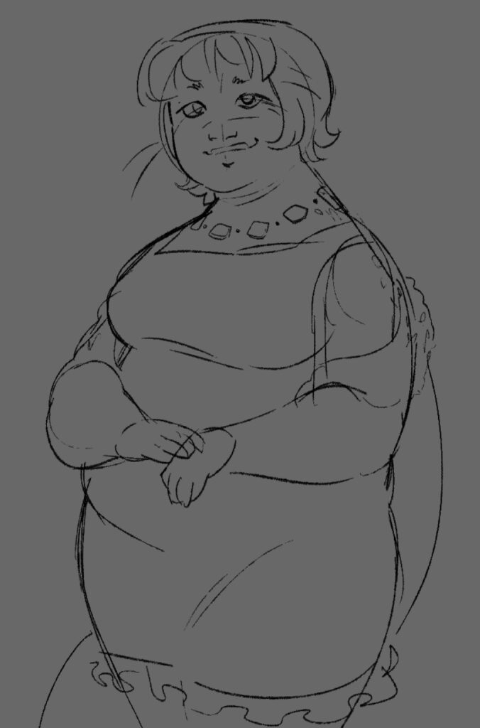
I started out with a rough sketch.
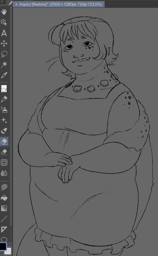
Then I went over and did the line work!
Now that that was done, this is where I started playing around with the screen tones. I decided to start with a darker tone for the dress and hair. As you can see, the dots are larger and farther apart. Afterwards, I went over with a smaller, more diamond-shaped screen tone for lighting details.
The lighting on the face looks a little weird but whatever! I also added to the line art some thinker line widths, to try and emulate a more organic feel.
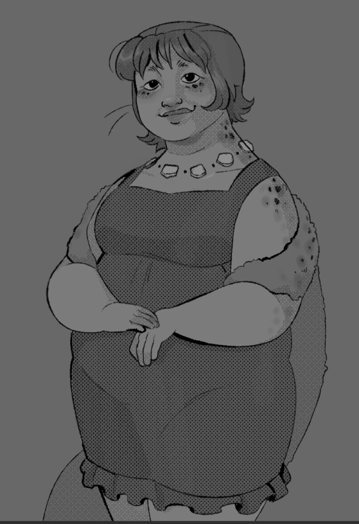
and this is the final result, where I added base skin tone and dress values underneath! While not my favourite piece, I feel that I definitely learnt a lot about using screen tones in digital art software.