Ian Worthington, known by his online alias “Worthikids,” is widely known for his unique, textured cartoonist art style, as well as his creation of 3d shows in Blender that look 2D, or integrate 2D art on top of 3D models.
As tackling 3D modelling for the first time would be a bit much as a single inquiry entry, I decided to try and emulate some of his 2D drawings and art style. Most of these drawings were taking from his Instagram, which you can find here!
https://www.instagram.com/worthikids/?hl=en
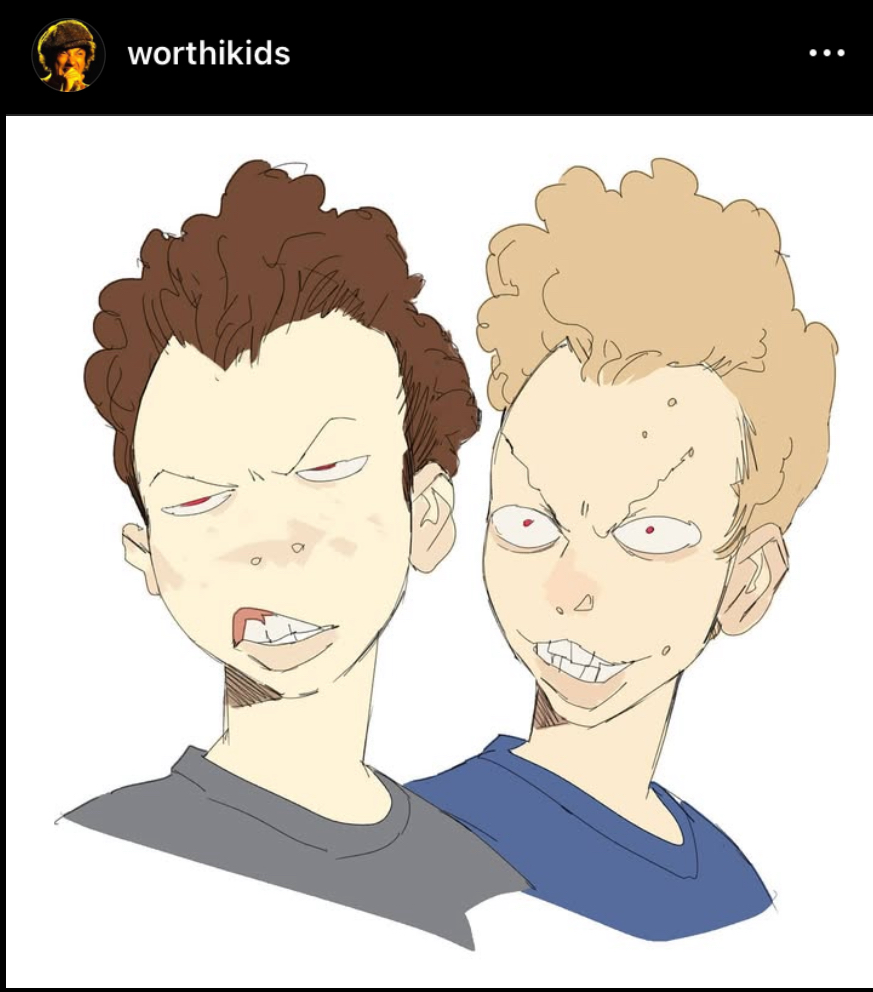
Starting by looking at these busts from Worthikids, I wanted to try to emulate the thin, messy lineart style and patchy skin painting. I find it fascinating how despite using more sketchy lines, Ian’s art remains punchy and easy to read due to the use of bold, simple colouring.
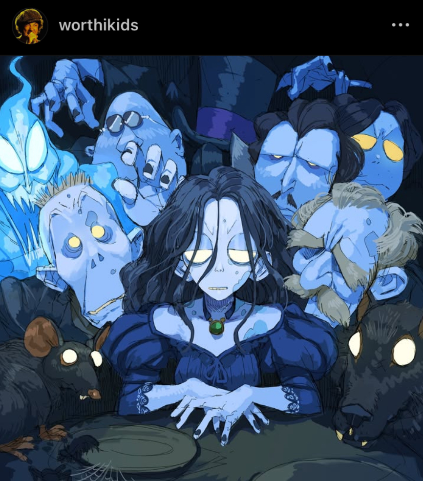
I’m also very drawn to the dramatic lighting in this piece of his. It seems that for the lighting, he uses a more painterly brush on top of solid, un painterly colours. Combining these techniques seen in these pieces, I gave the style my first go!
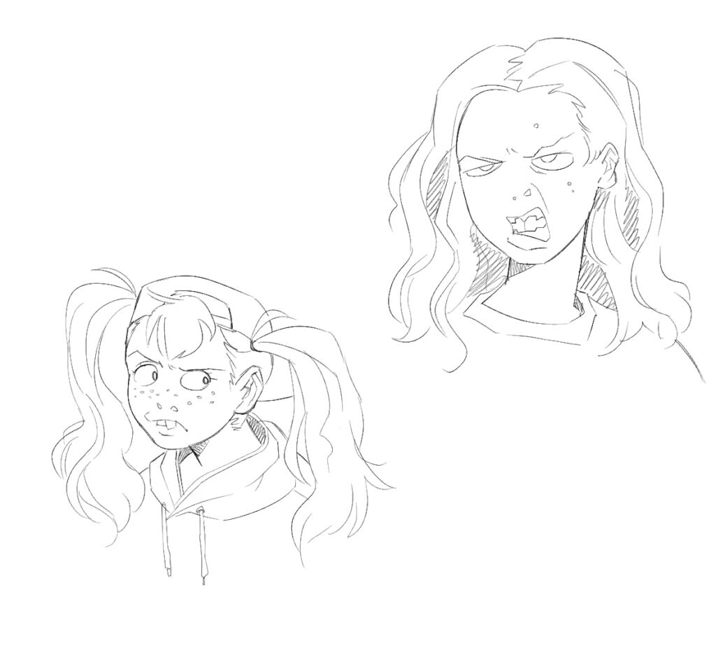
I started with a sketch. I’d noticed that Ian’s art style involved lines that, while confident, often retrace or build line width or contrast through layered lines. This brought me way out of my comfort zone, as I’ve had perfectly neat lineart drilled into me my whole life. I also tried drawing some fun teeth and used the blank “nostrils only” nose style as seen in the first piece referenced.
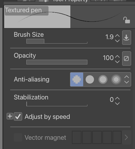
Here’s the brush I used! I turned off stabilization to get a more natural, messy line look. This format was very fun to play with, and I can see myself using this brush in personal work in the future.
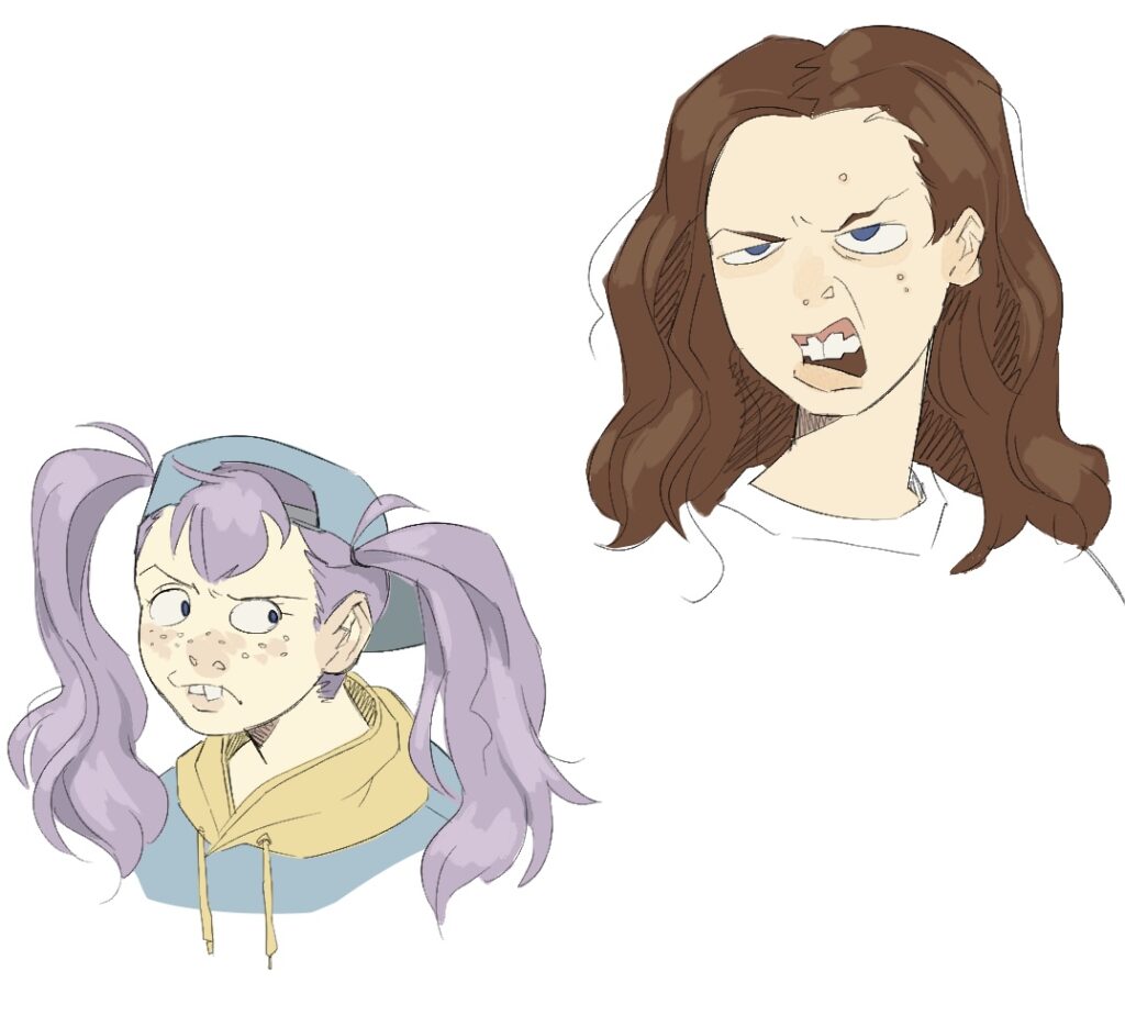
I then filled in the colours, adjusting them to get a more muted, natural look. I used a painterly brush for the highlights and shadows, as well as skin details. These turned out very fun!
For the last piece I tried, I referenced these portraits:
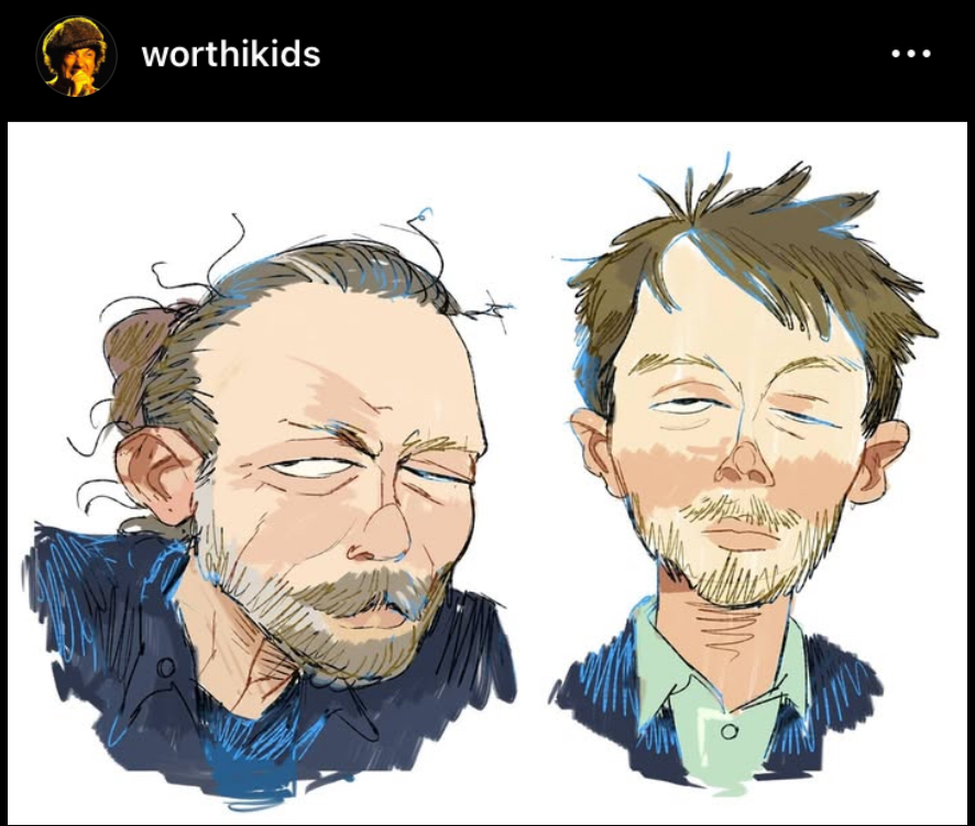
While using the same elements of the previous illustrations, (sketchy line art, painterly details, simple colours) this piece builds upon Ian’s art style as he adds hatching in the hair and clothes, as well as blue splashes in the line art. The base colours themselves also seem to be painted, as we can see the white of the canvas peeking through. I decided to give this style a go!
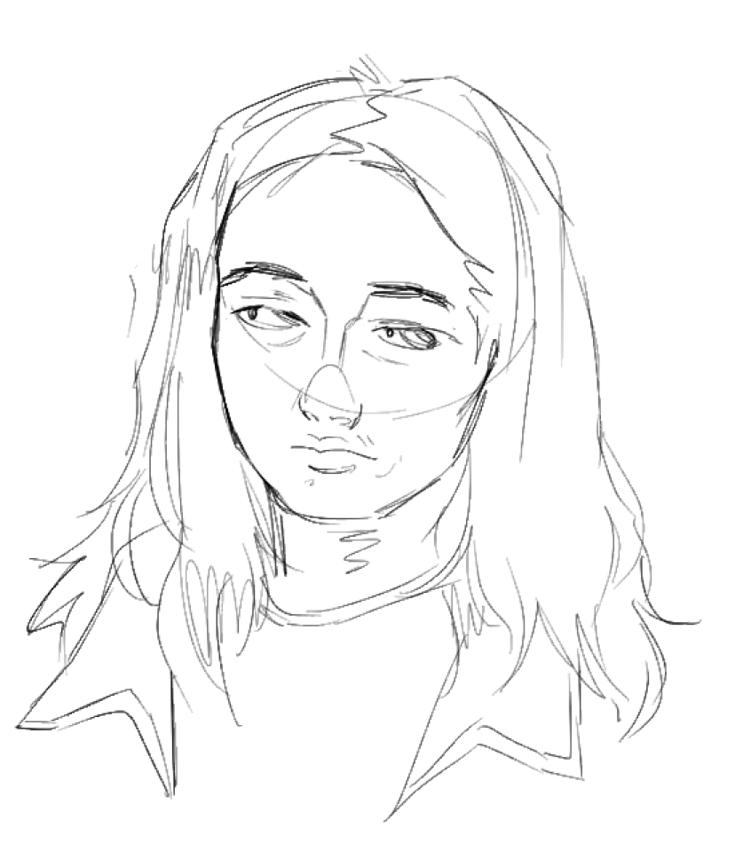
I started with a rough sketch, paying special attention to how Ian draws noses and nose bridges.
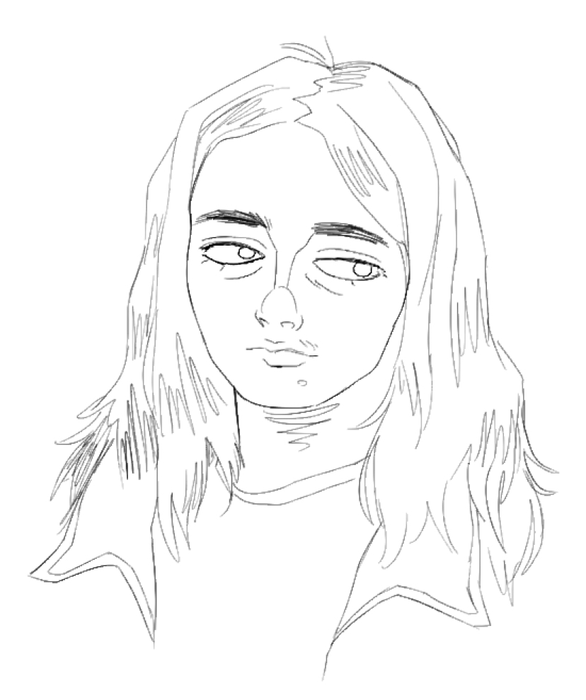
I then went over and drew more detailed line art, without construction lines.
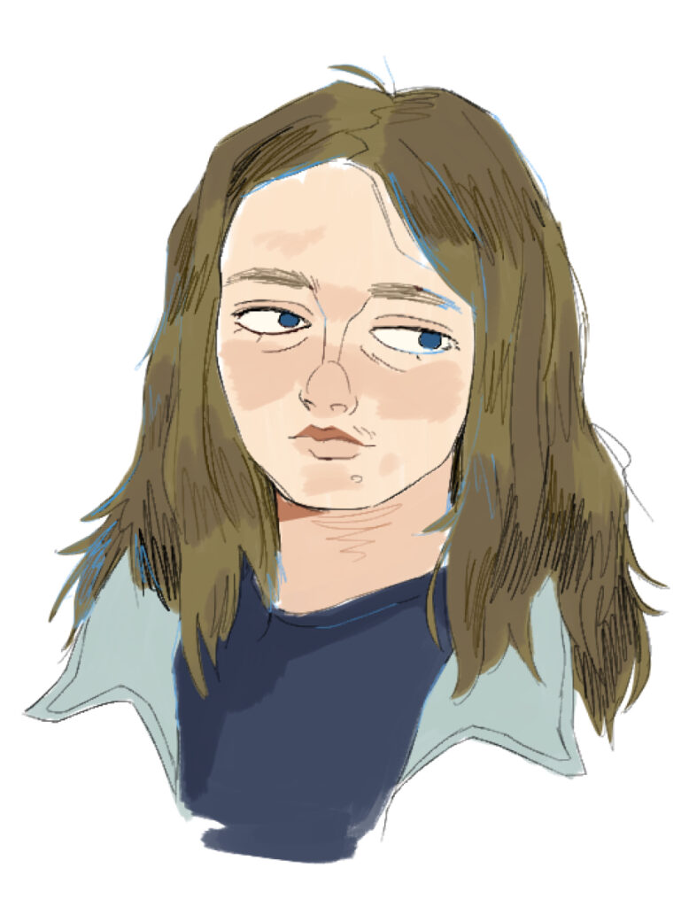
Finally I went in and added colour, as well as hatching in the hair and blue splashes. I probably could’ve added more hatching to the clothing, but I still like the vibe of this finished piece.