Category: EDCI 336 (Page 1 of 2)

This is a category for the EdTech course. Please add this category in addition to the relevant edtech assignment category(ies).

Technology and Outdoor Education

Today in class, we went outside to scan QR codes at Finnerty Gardens, which showed us videos about its history. It was a lovely time, and I had so much fun! Getting to see the ducks was a highlight for sure, and it was so much easier to be engaged in learning when you could run between places! I can’t imagine how wonderful it would be to implement these teaching strategies into Elementary classrooms, especially for students who have trouble sitting still. (Which might be most students, actually).

Kirsten Pierce was our guest speaker, who talked about technology and the outdoors. I found it interesting when she emphasized;

ā€œChildren, when watching and learning about things very far away, they get a very glorified (and valid) appreciation of those animals. But it’s important that they develop an appreciation for the animals around them and a sense of place.ā€

Here are some photos I took during the walk!

Technology and Inclusion

Kaori Lau and Niesha Blajberg from the BCEAccess Society came to visit class, discussing how we can use technology to be inclusive in the classroom. The BCEdAccess Society is a volunteer organization which serves families of students with disabilities and complex learners.

some tech resources for supporting students include:

  • Text to speech
  • Microphone
  • Translators
  • Subtitles
  • Eye Gaze Systems
  • Audio recorders

Some common challenges that may arise with trying to implement this inclusive technology into classrooms include a potential lack of access (whether that be from the school’s lack of funding, or families not having devices or reliable internet), a lack of support, resistance to change, privacy and data security concerns, and finally technology as a distraction.

Advocate for funding, loaner programs, and grants. Try to include assistive tech in Individual Education Programs. Ensure compliance with privacy laws, and normalize assistive tech and make it accessible for all people. Write assistive cell phone use into IEPs for clarity.

We still have a lot of racist and ableist resources in the school curriculum, which are often brought to attention by students and parents. If something is brought to your attention for being discriminatory, try not to be defensive! We learn from our mistakes.

Assuming the goal is to be independent of the use of technology

An initiative started by BCEdAccess in 2018 shows students with designations are being excluded from school and don’t have equitable access to an education.

I found this talk to be very informative, especially as I don’t have too much experience helping students with learning disabilities. I did find that when helping one student with dyslexia, text to speech was very effective however!

Free Inquiry: Art Summary!

For my final inquiry post, here’s a collage of all the pieces I’ve made! I feel like I learnt so much during this process, both how to use certain digital art programs (Clip Studio Paint), and new drawing techniques (especially around line art textures!) doing this inquiry project has informed me and I will be able to take what I’ve learnt throughout this experience and apply it to personal art going forward.

Free Inquiry: Ari Okshurg

Ari Okshurg (known online under the username @ariokshurg), is known for their professional, Disney-esque art style. Some unique features of this style include warm, muted colour palettes, detailed clothing folds, and strong shape language. You can view their portfolio here! https://cara.app/ariokshurg

For this style study, I referenced these two drawings.

Some things I observed were the loose, sketchy line quality similar to Ian Worthington. The top drawing is neater, but looking at the line widths it looks as if Ari directly used the sketch, erasing and cleaning it up as they went. Ari’s hand drawings are also very unique, with prominent knuckles and box-like fingers. Bearing this in mind, I gave the style my first go!

This here was a warm-up sketch, where I tried to familiarize myself with the unique facial structure and style of drawing hands. The one holding the mug seems fairly accurate, but the outstretched hand looks very poo poo stinky bad!

Next, I tried drawing a sketch for a coloured piece. I drew this character of mine again!

I really liked trying to draw an open mouth in the warmup, so I tried to have her look mid-conversation. I had fun drawing the angular eyelids and angular folds in the coat. Or flannel?? What’s it called when it’s like a flannel but doesn’t have the plaid pattern I don’t know fashion names… ā€œWhy don’t you Google it?ā€ Shhhh shhh it’s my inquiry I get to fill space with unrelated tangents! Anyway

Like the pieces I referenced, I decided to go straight from this sketch to the colouring! I originally tried sampling directly from the reference images, but it turned out kind of muddied and weirdly greenish, so I played around with colour balancing until I found some colours I was happy with.

Here’s the final drawing! I ended up adding some greenish-blue shadows faintly overtop, which you can see under the collar and in the hair. This isn’t usually a feature of Ari’s style, but this piece was begging for it. It shook me back and forth yelling ā€œgive me blue-green shadows or ELSE!ā€ Which was admittedly rather surprising like you’re a drawing you’re not meant to tell me what to do but it happened anyway sooo

This style of drawing was really fun! Between this and Ian Worthington’s art style, I’m definitely more drawn to sketchy lineart the older I get.

Free Inquiry: Tomodachi Life

Last Thursday, a sequel to the video game ā€œTomodachi Lifeā€ was announced. This has been one of my most anticipated games ever, so I decided to channel that excitement into doing a style study/inspired piece based off the new trailer! You can watch the trailer here:

I first started with a rough sketch, as usual. I tried drawing the characters from the trailer, which made it take a little longer than usual!

Once I’d decided on a composition, I started on the line art, using the turnip pen. It was very tricky trying to keep the characters looking very digital and symmetrical!

I then added the base colours, creating gradients by selecting the hair and blurring the colours in between.

It’s coming together nicely already! I then added some simple shading.

From here, I then coloured the line work! I find I really like to colour details that make up a whole (e.g, the collar and shirt details on the yellow dress above), while keeping the lines that separate parts (the sleeve connecting the dress to the arm) solid black. This helps keep the piece bold and punchy so you can clearly distinguish what you’re looking at, while not muddying things that don’t need to be solid colours.

I then added a subtle gradient overlay, and some daffodils at the front! There are also some extra highlights I added.

Finally, I added a photo of a beach, which I locked to a layer that I scribbled a textured brush on! I also played around with the sharpness and contrast a bit.
This was very fun to do! I definitely rushed a bit (the old man magically floating in the back being proof of that), but drawing what you’re excited about is a really great motivator.

Free Inquiry: Notes App Transfer

Doodling in Apple’s notes app can be really fun! I decided to try transferring a sketch from the notes app into Clip Studio Paint to experiment with. Here’s the process!

I first started with a sketch. I usually keep my tablet in dark mode, so I’ll have to figure out how to invert the colours later. Here’s a Timelapse of two of the faces!

As you can see these were doodled in my Psych notes. Oops!
I then screenshotted and imported the drawing into Clip Studio Paint, applying the ā€œreverse gradientā€ setting to swap the black and white of the picture around.
I also tried adding some simple values, and made sure the head size of the figures matched. Here’s the final Timelapse! (There are lots of flashing lights in this video!)

This was honestly a super fun way to draw! I find it’s very easy to get perfectionistic and take forever using professional software, so jumping between the two really helped me create in a more free flowing way!

Free Inquiry: Screen Tones

For this piece, I wanted to experiment with screen tones! Screen tones are the little shading dots you see on old magazines and comics, where colours like purple will be made up of tons of red and blue dots. I did this one is greyscale, in order to get accustomed to using screen tones.

in Clip Studio Paint, the screen tone setting can be found under the ā€œlayer settingsā€ category. The tones become more or less visible with the opacity toggle, which is a little confusing at first!

I started out with a rough sketch.

Then I went over and did the line work!

Now that that was done, this is where I started playing around with the screen tones. I decided to start with a darker tone for the dress and hair. As you can see, the dots are larger and farther apart. Afterwards, I went over with a smaller, more diamond-shaped screen tone for lighting details.

The lighting on the face looks a little weird but whatever! I also added to the line art some thinker line widths, to try and emulate a more organic feel.

and this is the final result, where I added base skin tone and dress values underneath! While not my favourite piece, I feel that I definitely learnt a lot about using screen tones in digital art software.

Free Inquiry: Traditional Transfer

Today, instead of a specific artist, I experimented with transferring a traditional sketch to a digital drawing, using Ibis Paint (a free software) and Clip Studio Paint for touch ups.
For this I drew the character Dimentio from Super Paper Mario, because I really love his design! So credit to Nintendo for the reference in the top right.

Here’s the sketch! I first drew it with pencil, then made the contrast stronger using a Bic pen.

Then, I used this photo I took and used the ā€œextract line drawingā€ setting, where it makes the white of the image transparent. I then coloured it in, blurring locked layers to create gradients. Here’s a time lapse of the colouring process!

You might notice I also coloured the line work, trying to make it more unified. Now that the base colours were done, I ported it over to Clip Studio Paint, where I added some lighting.

Altogether, this was a very exciting experiment. I think the end result turned out surprisingly nice, and in some ways the pencil texture added lots of charm!

Free Inquiry: Family Guy

Alright I’m going to be honest this started as a complete joke but I am VERY behind on these inquiry posts so why not! Family Guy art style (and by art style literally just Peter Griffin)

My muse for this drawing was Daniel! He asked for it sooo

I started with this JPEG of Peter Griffin pulled from Google Images. I regretted picking this one quickly as it has actual lighting, as you can see, which is more detailed than the usual Family Guy art style. I’m pretty sure. I’ve never even watched Family Guy I don’t even think I’d like it very much

I then extracted the lineart from this using the ā€œextract lineartā€ effect, and drew my own lineart over top. Some notable changes included a hoodie, different shoes, more square glasses, and a receding hairline since I was a little mean sorry Daniel šŸ˜”

The default brush I normally use already for very well, so I stuck with it. Here’s the configuration!

Next, I went in with the flat colours!

Wow. That’s very Daniel!

I then added the lighting to try to match the skin from the Peter Griffin model.

And finally, I added a backdrop from Family Guy and a noise filter to try to make it look more cohesive!

As a fun bonus touch, I cropped the image and ran it through an image de-scaler, to make it look as if it were a screenshot that had been circulating around the internet for a while, slowly losing quality.

It’s the spitting image!

AI in the Classroom

Things you can use an AI for:

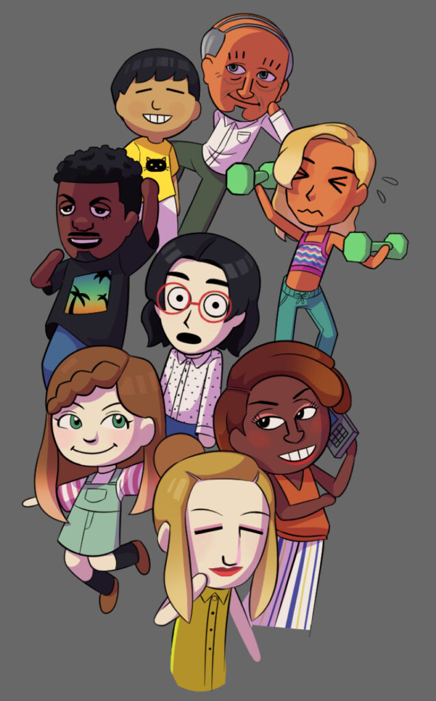
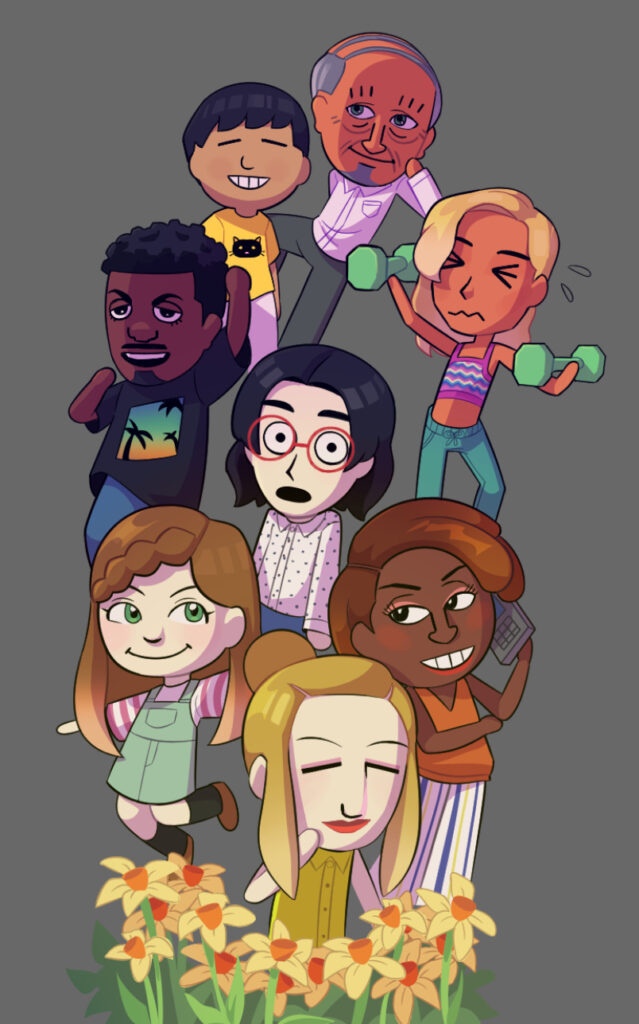
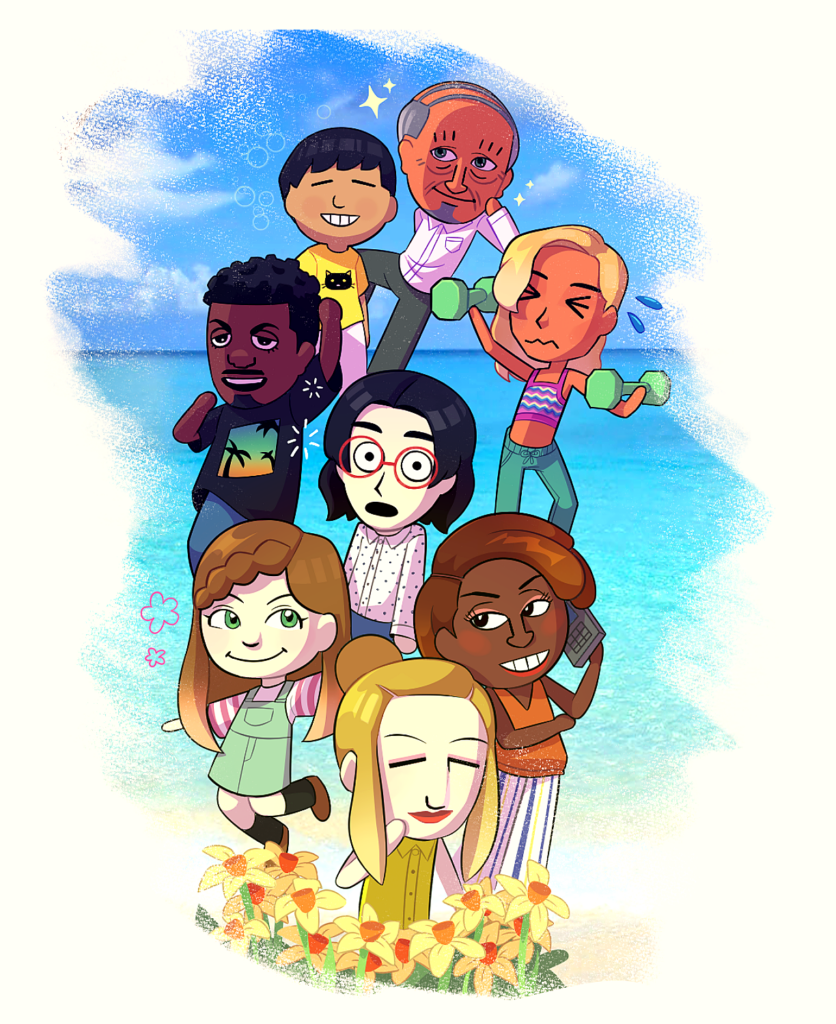
AI can be used in the classroom by creating an alphabet out of something on labs.google ā€œGENTYPEā€

Making lesson plans, writing emails, saving time in general.

What do we currently know about AI?

There are “AI-detecting tools” or websites, which we will have to be accustomed to as students cheat assignments using AI. However, these often aren’t accurate, so you will often have to trust students.

Document Revision history: super important for identifying AI! available on Docs and Word. Perhaps it’ll be integrated into more as it becomes a wider issue.

We’ve had AI before, however they were mostly predictive (machine learning). What’s new is a focus on generative AI, with chatbots and artificial image generators.

AI (chatGPT) uses as much energy in a day that it would take to power the empire State Building for 270 days

Everyone in Belgium could flush the toilet to use the same amount of water from ChatGPT in a day. and estimated 10.58 million gallons of water each day

Ai has bias! Most data it is trained on is western data, so there is some reinforcement of stereotypes. However, Google’s efforts to include more diverse people represented in images resulted in historical images not being accurate either. Oops!

What about learning?

The space between asking a question and finding information can be a space for learning for students

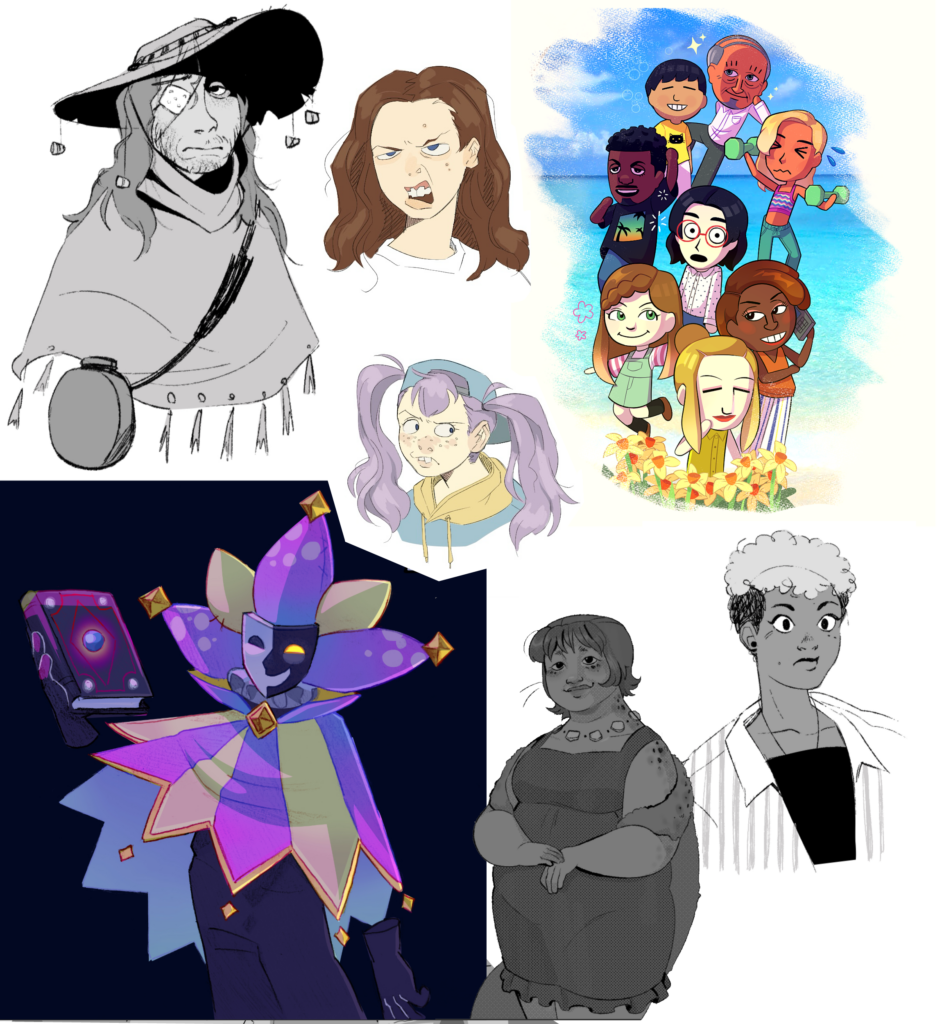
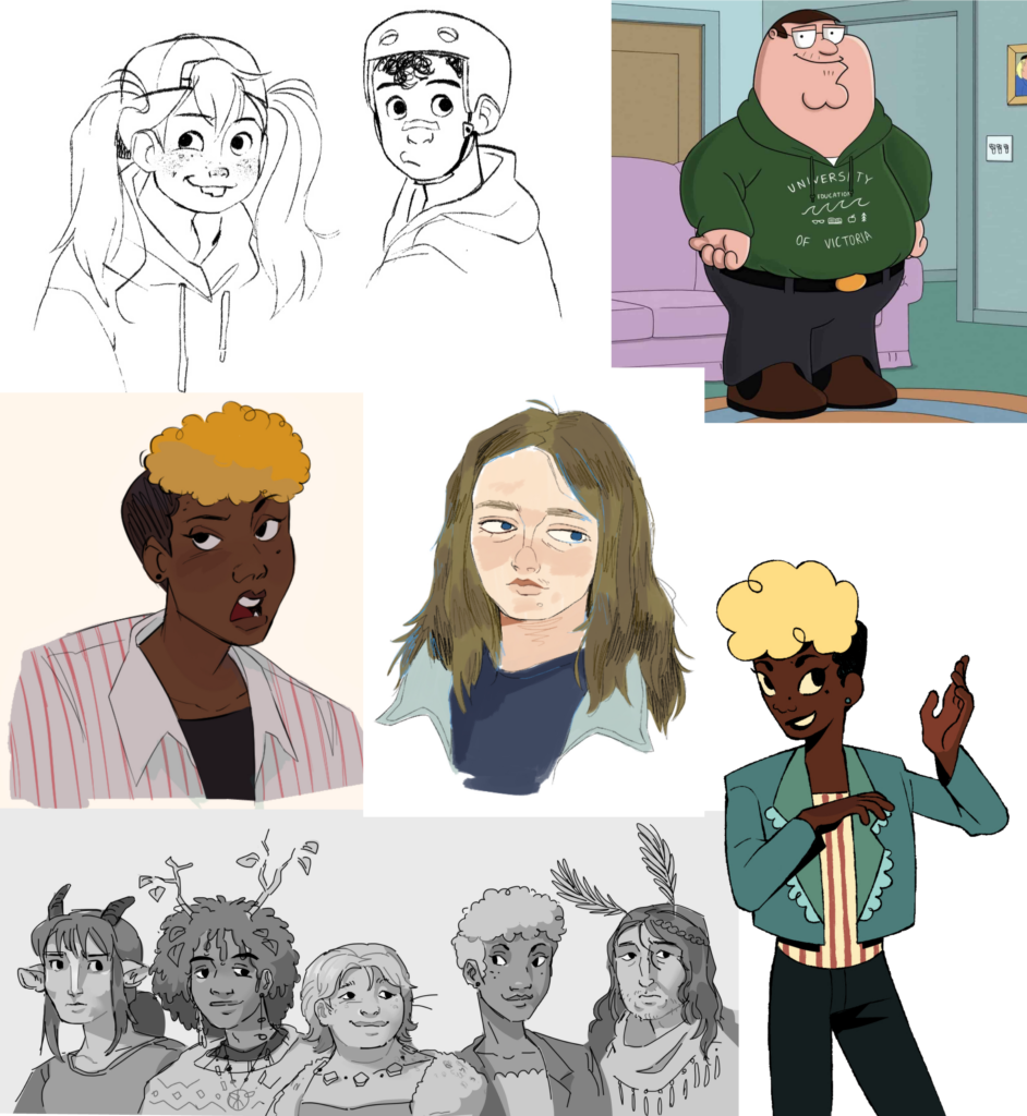
Celebrate human creation:

Develop and cultivate skills that AI can’t do-emphasize the importance of your unique voice, and the value of personal attribution. I think with creative jobs and opportunities being taken by generative AI, as teachers we will have to work harder to make sure students can take pride in their work and see the value of their own creative visions. By emphasizing the story and personal history behind a story, song, or visual media, we can help cultivate an appreciation for human expression that isn’t seen within generative AI.

« Older posts

© 2025 Miranda's Portfolio

Theme by Anders NorenUp ↑