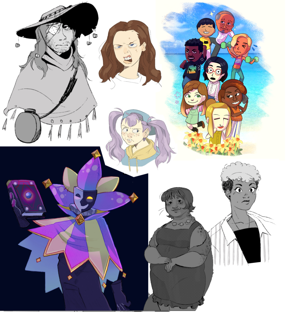
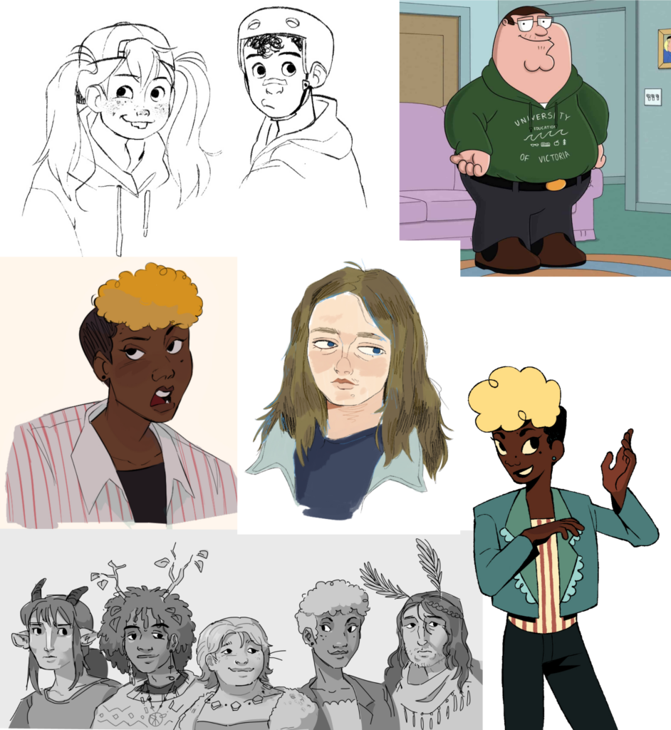
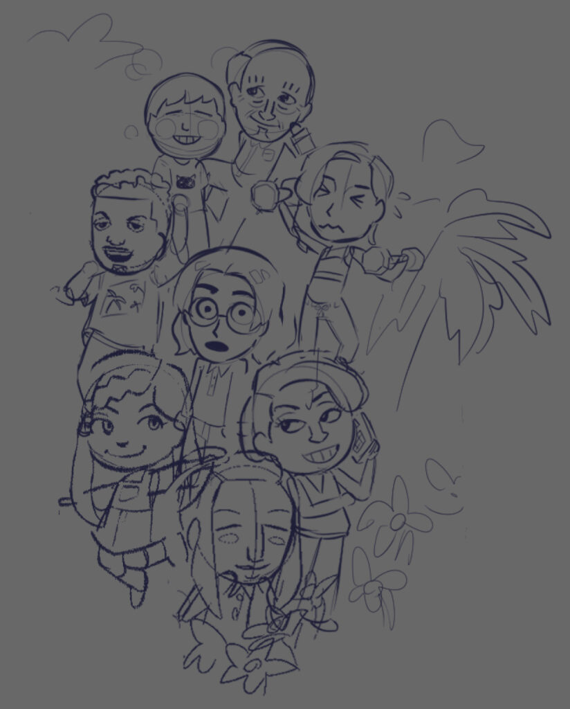
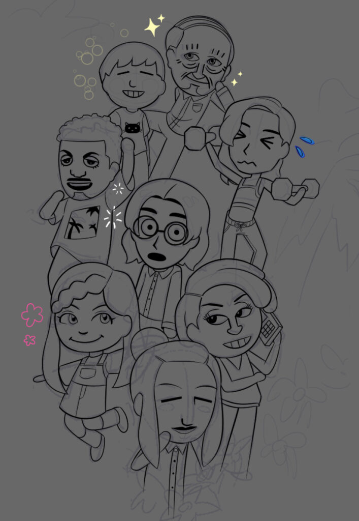
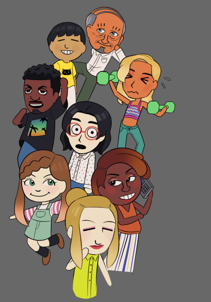
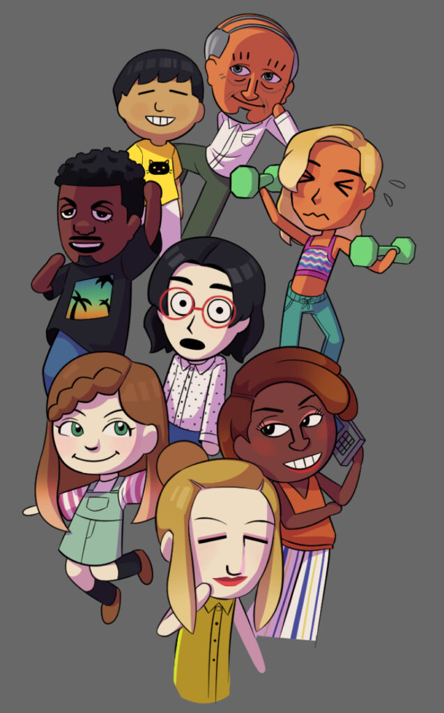
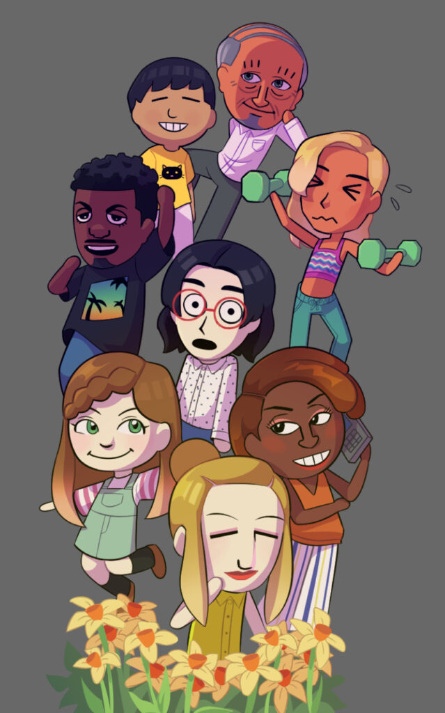
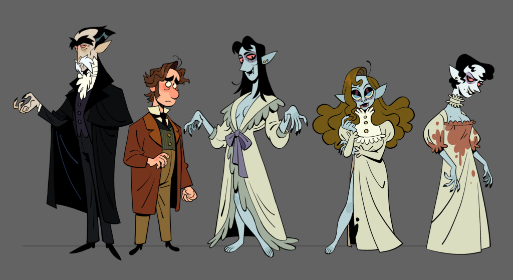
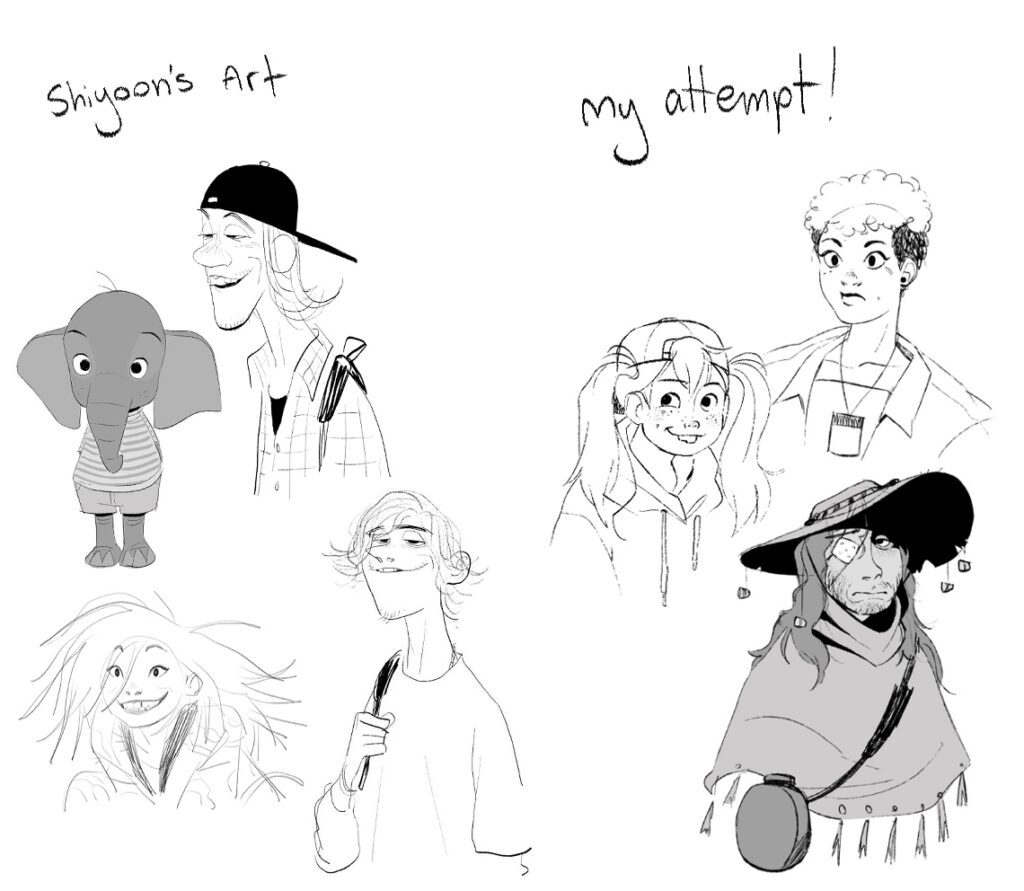
For my final inquiry post, here’s a collage of all the pieces I’ve made! I feel like I learnt so much during this process, both how to use certain digital art programs (Clip Studio Paint), and new drawing techniques (especially around line art textures!) doing this inquiry project has informed me and I will be able to take what I’ve learnt throughout this experience and apply it to personal art going forward.
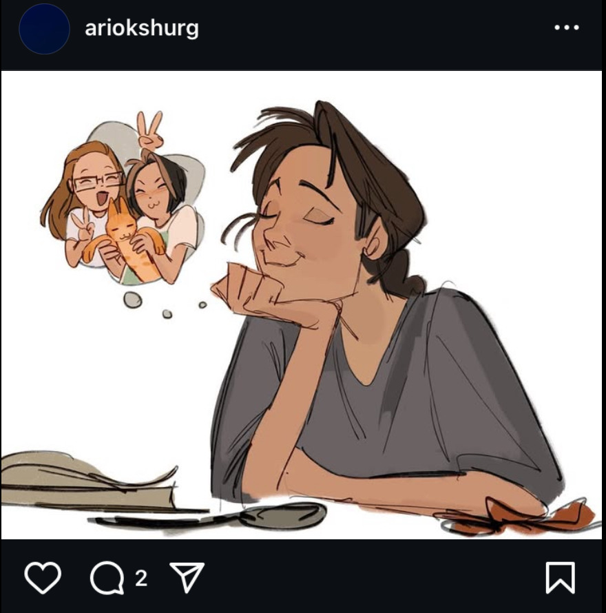
Ari Okshurg (known online under the username @ariokshurg), is known for their professional, Disney-esque art style. Some unique features of this style include warm, muted colour palettes, detailed clothing folds, and strong shape language. You can view their portfolio here! https://cara.app/ariokshurg
For this style study, I referenced these two drawings.
Some things I observed were the loose, sketchy line quality similar to Ian Worthington. The top drawing is neater, but looking at the line widths it looks as if Ari directly used the sketch, erasing and cleaning it up as they went. Ari’s hand drawings are also very unique, with prominent knuckles and box-like fingers. Bearing this in mind, I gave the style my first go!
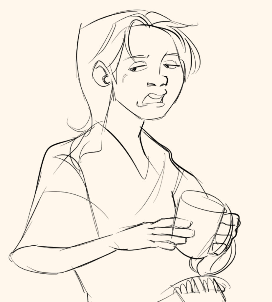
This here was a warm-up sketch, where I tried to familiarize myself with the unique facial structure and style of drawing hands. The one holding the mug seems fairly accurate, but the outstretched hand looks very poo poo stinky bad!
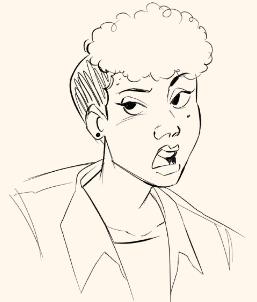
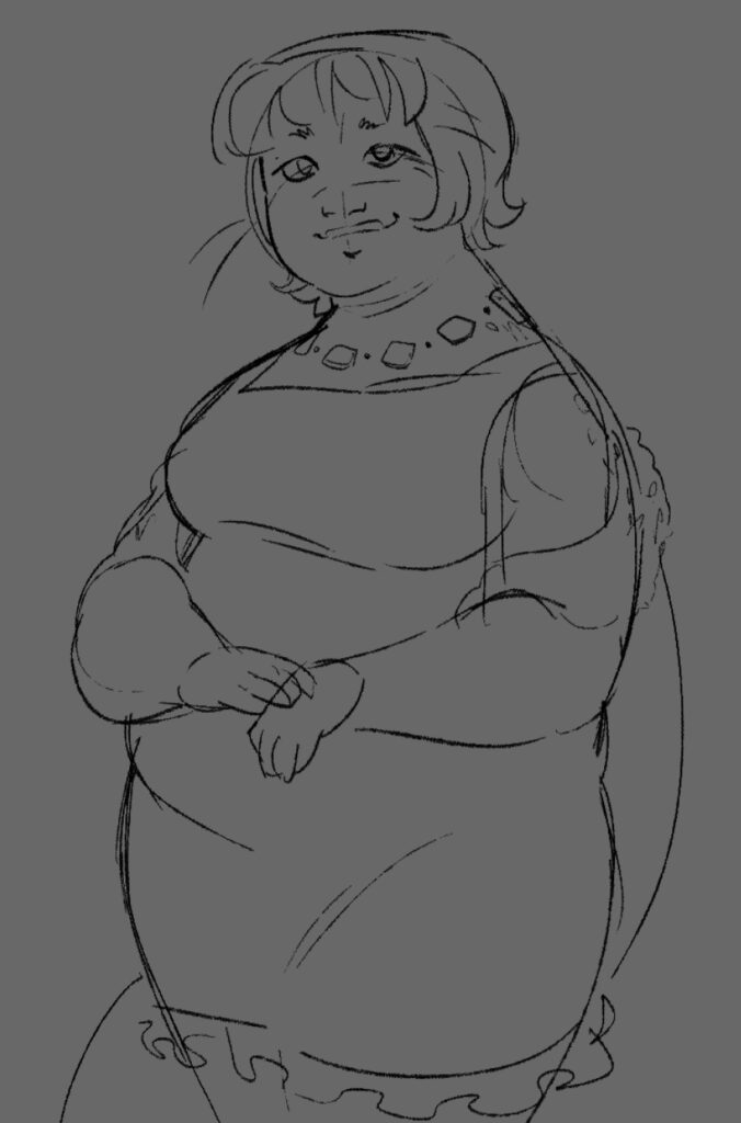
Next, I tried drawing a sketch for a coloured piece. I drew this character of mine again!
I really liked trying to draw an open mouth in the warmup, so I tried to have her look mid-conversation. I had fun drawing the angular eyelids and angular folds in the coat. Or flannel?? What’s it called when it’s like a flannel but doesn’t have the plaid pattern I don’t know fashion names… “Why don’t you Google it?” Shhhh shhh it’s my inquiry I get to fill space with unrelated tangents! Anyway
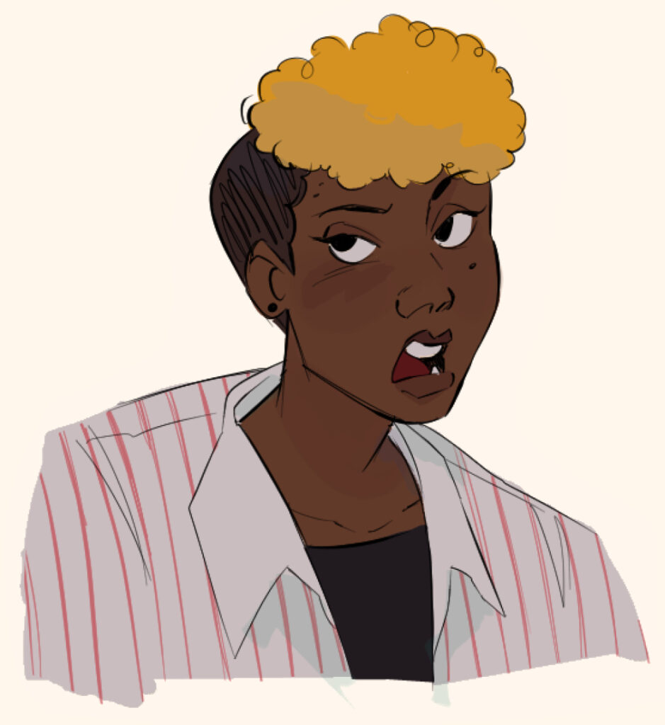
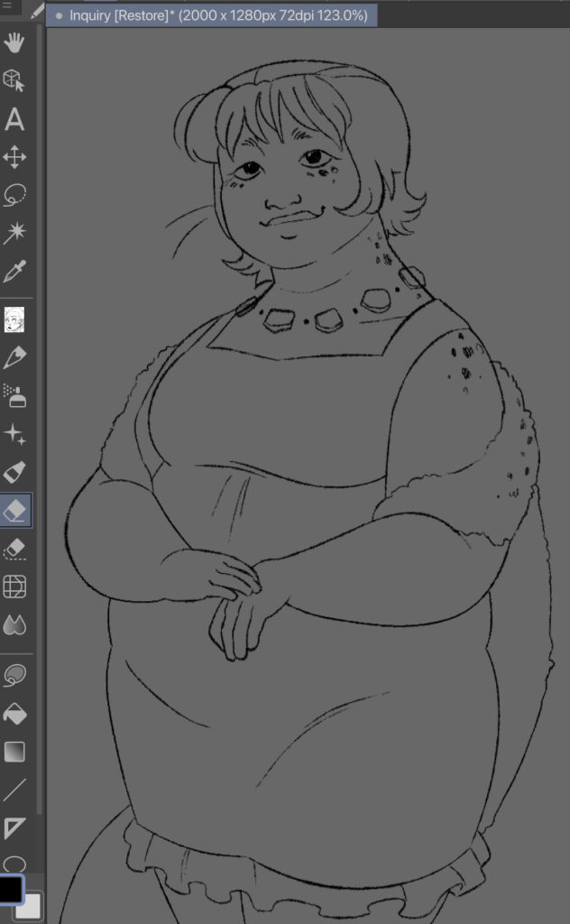
Like the pieces I referenced, I decided to go straight from this sketch to the colouring! I originally tried sampling directly from the reference images, but it turned out kind of muddied and weirdly greenish, so I played around with colour balancing until I found some colours I was happy with.
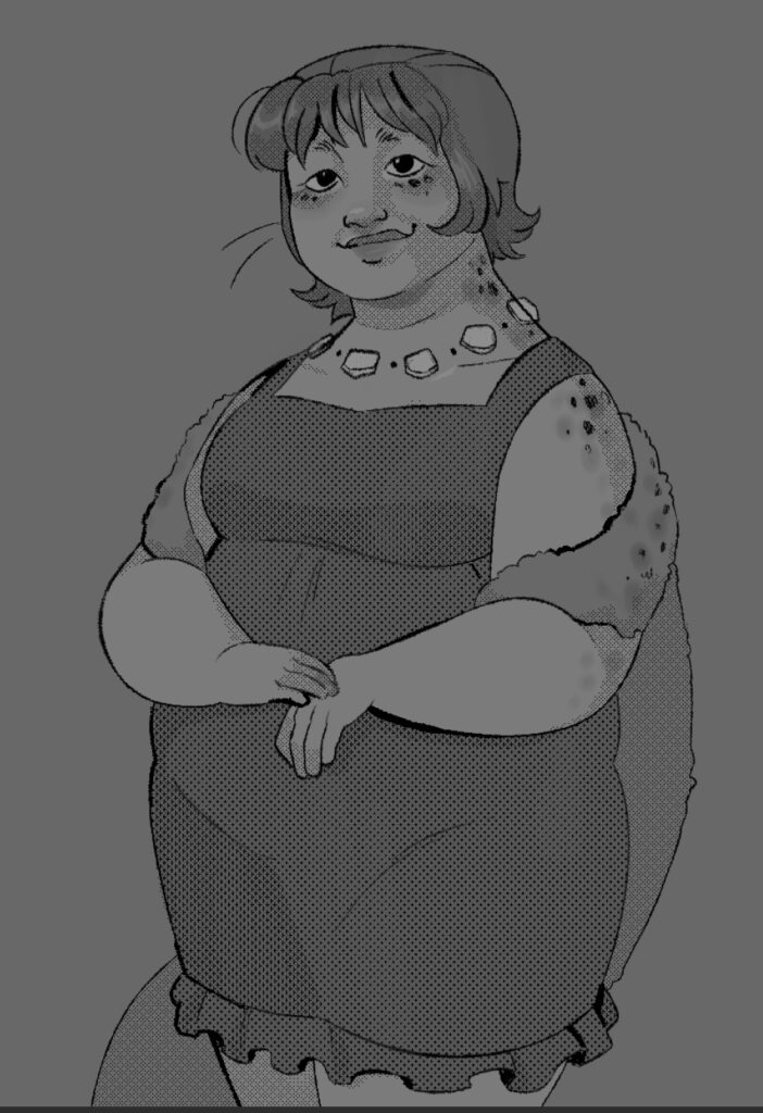
Here’s the final drawing! I ended up adding some greenish-blue shadows faintly overtop, which you can see under the collar and in the hair. This isn’t usually a feature of Ari’s style, but this piece was begging for it. It shook me back and forth yelling “give me blue-green shadows or ELSE!” Which was admittedly rather surprising like you’re a drawing you’re not meant to tell me what to do but it happened anyway sooo
This style of drawing was really fun! Between this and Ian Worthington’s art style, I’m definitely more drawn to sketchy lineart the older I get.
Last Thursday, a sequel to the video game “Tomodachi Life” was announced. This has been one of my most anticipated games ever, so I decided to channel that excitement into doing a style study/inspired piece based off the new trailer! You can watch the trailer here:
I first started with a rough sketch, as usual. I tried drawing the characters from the trailer, which made it take a little longer than usual!
Once I’d decided on a composition, I started on the line art, using the turnip pen. It was very tricky trying to keep the characters looking very digital and symmetrical!
I then added the base colours, creating gradients by selecting the hair and blurring the colours in between.
It’s coming together nicely already! I then added some simple shading.
From here, I then coloured the line work! I find I really like to colour details that make up a whole (e.g, the collar and shirt details on the yellow dress above), while keeping the lines that separate parts (the sleeve connecting the dress to the arm) solid black. This helps keep the piece bold and punchy so you can clearly distinguish what you’re looking at, while not muddying things that don’t need to be solid colours.
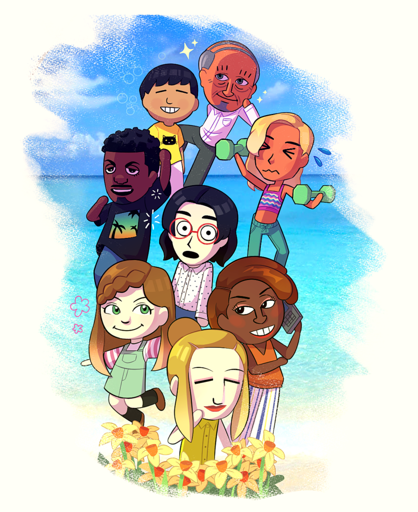
I then added a subtle gradient overlay, and some daffodils at the front! There are also some extra highlights I added.
Finally, I added a photo of a beach, which I locked to a layer that I scribbled a textured brush on! I also played around with the sharpness and contrast a bit. This was very fun to do! I definitely rushed a bit (the old man magically floating in the back being proof of that), but drawing what you’re excited about is a really great motivator.
Doodling in Apple’s notes app can be really fun! I decided to try transferring a sketch from the notes app into Clip Studio Paint to experiment with. Here’s the process!
I first started with a sketch. I usually keep my tablet in dark mode, so I’ll have to figure out how to invert the colours later. Here’s a Timelapse of two of the faces!
As you can see these were doodled in my Psych notes. Oops! I then screenshotted and imported the drawing into Clip Studio Paint, applying the “reverse gradient” setting to swap the black and white of the picture around. I also tried adding some simple values, and made sure the head size of the figures matched. Here’s the final Timelapse! (There are lots of flashing lights in this video!)
This was honestly a super fun way to draw! I find it’s very easy to get perfectionistic and take forever using professional software, so jumping between the two really helped me create in a more free flowing way!
For this piece, I wanted to experiment with screen tones! Screen tones are the little shading dots you see on old magazines and comics, where colours like purple will be made up of tons of red and blue dots. I did this one is greyscale, in order to get accustomed to using screen tones.
in Clip Studio Paint, the screen tone setting can be found under the “layer settings” category. The tones become more or less visible with the opacity toggle, which is a little confusing at first!
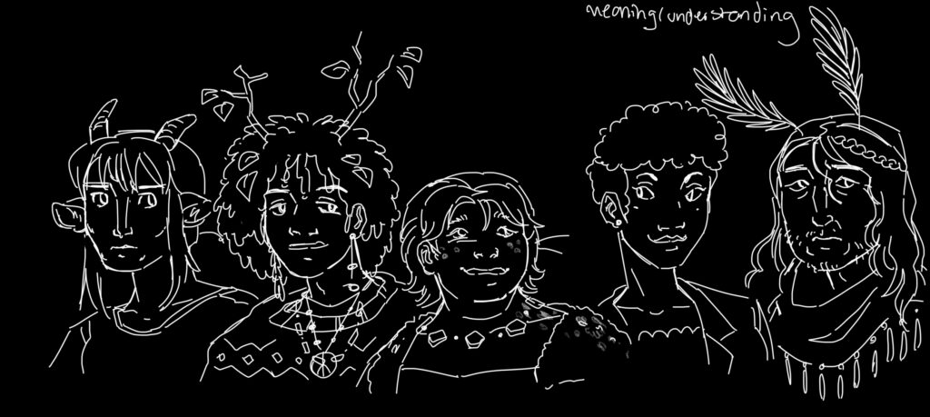
I started out with a rough sketch.
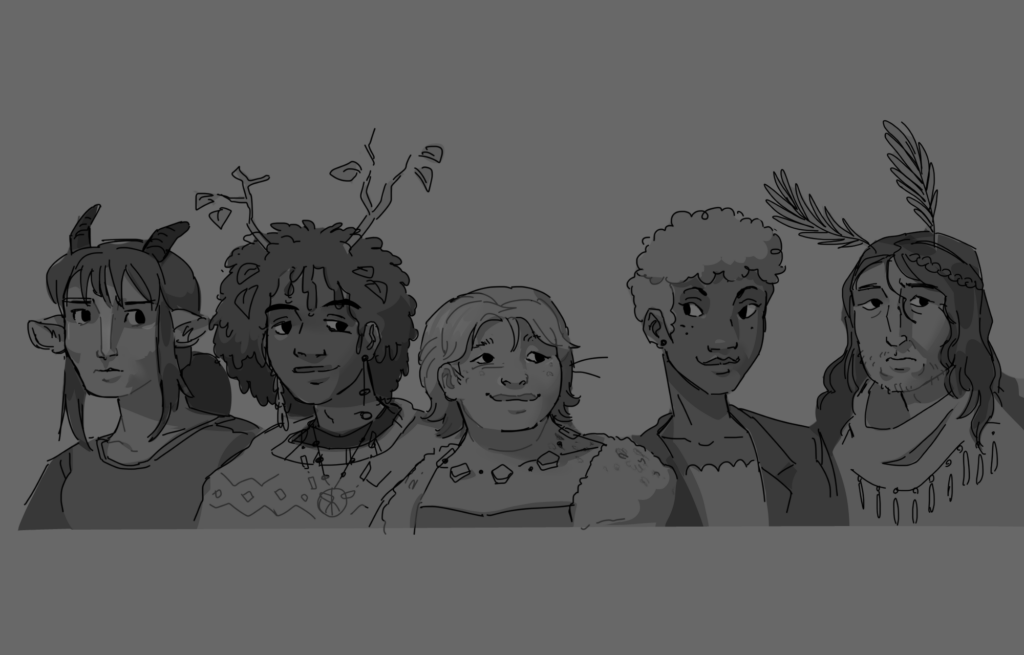
Then I went over and did the line work!
Now that that was done, this is where I started playing around with the screen tones. I decided to start with a darker tone for the dress and hair. As you can see, the dots are larger and farther apart. Afterwards, I went over with a smaller, more diamond-shaped screen tone for lighting details.
The lighting on the face looks a little weird but whatever! I also added to the line art some thinker line widths, to try and emulate a more organic feel.
and this is the final result, where I added base skin tone and dress values underneath! While not my favourite piece, I feel that I definitely learnt a lot about using screen tones in digital art software.
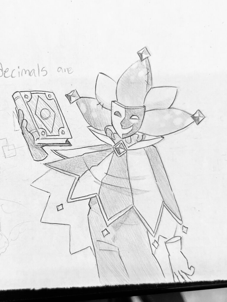
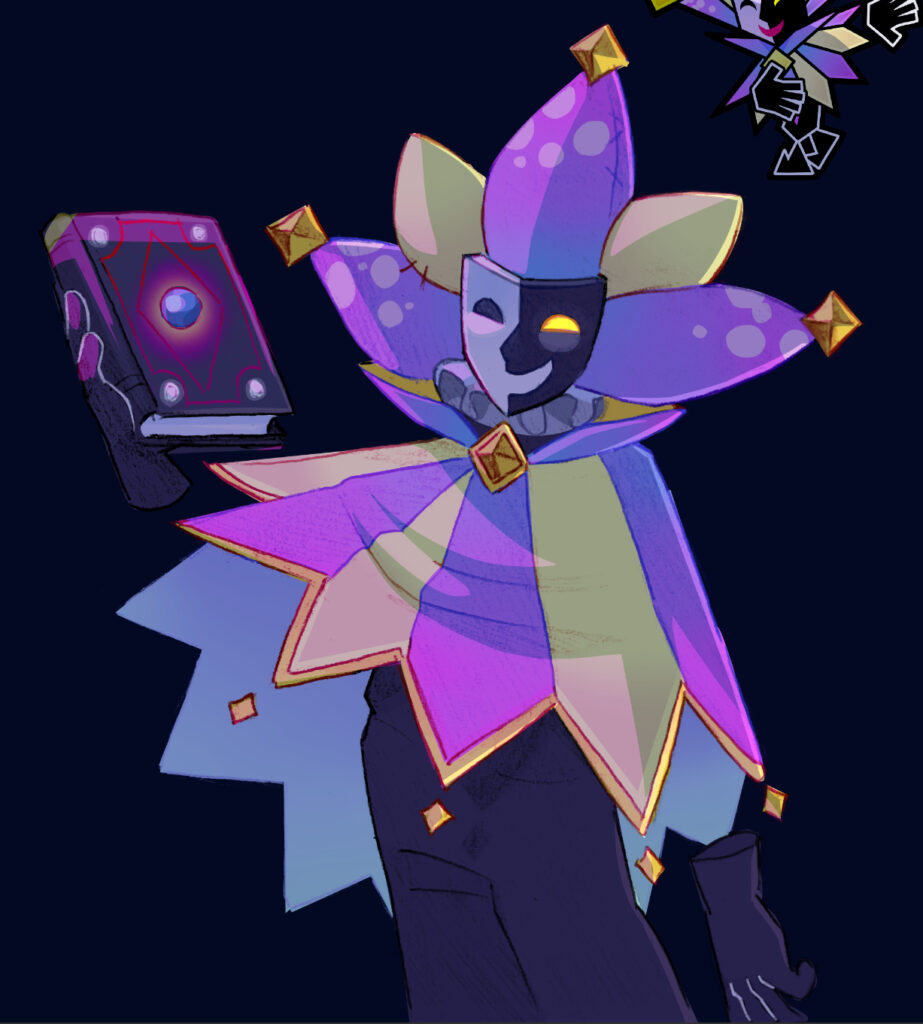
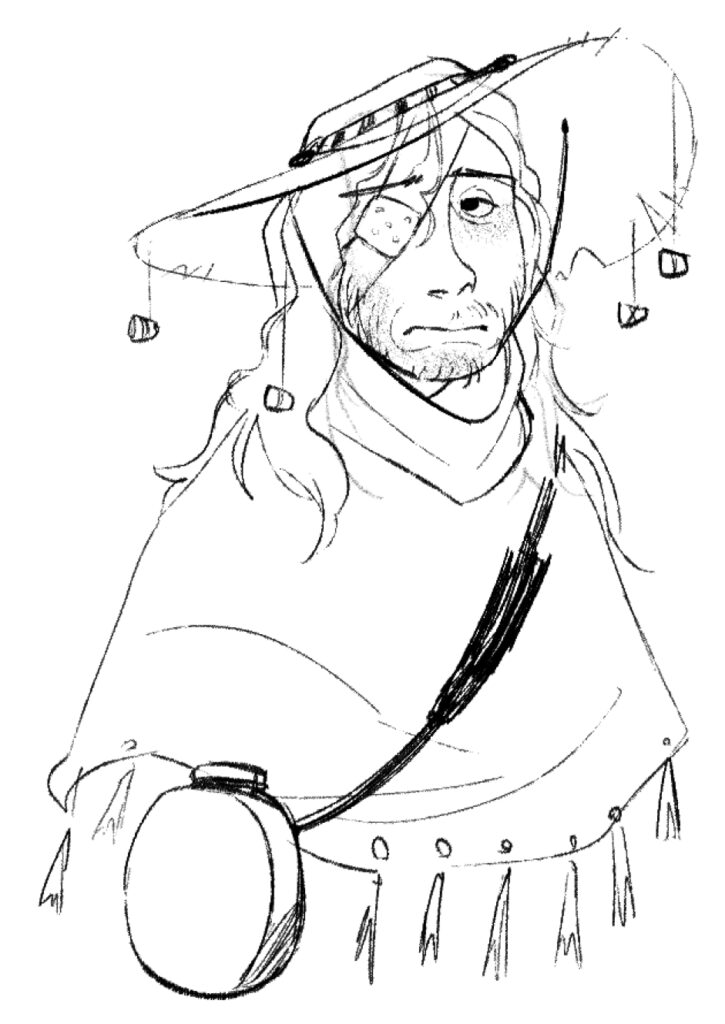
Today, instead of a specific artist, I experimented with transferring a traditional sketch to a digital drawing, using Ibis Paint (a free software) and Clip Studio Paint for touch ups. For this I drew the character Dimentio from Super Paper Mario, because I really love his design! So credit to Nintendo for the reference in the top right.
Here’s the sketch! I first drew it with pencil, then made the contrast stronger using a Bic pen.
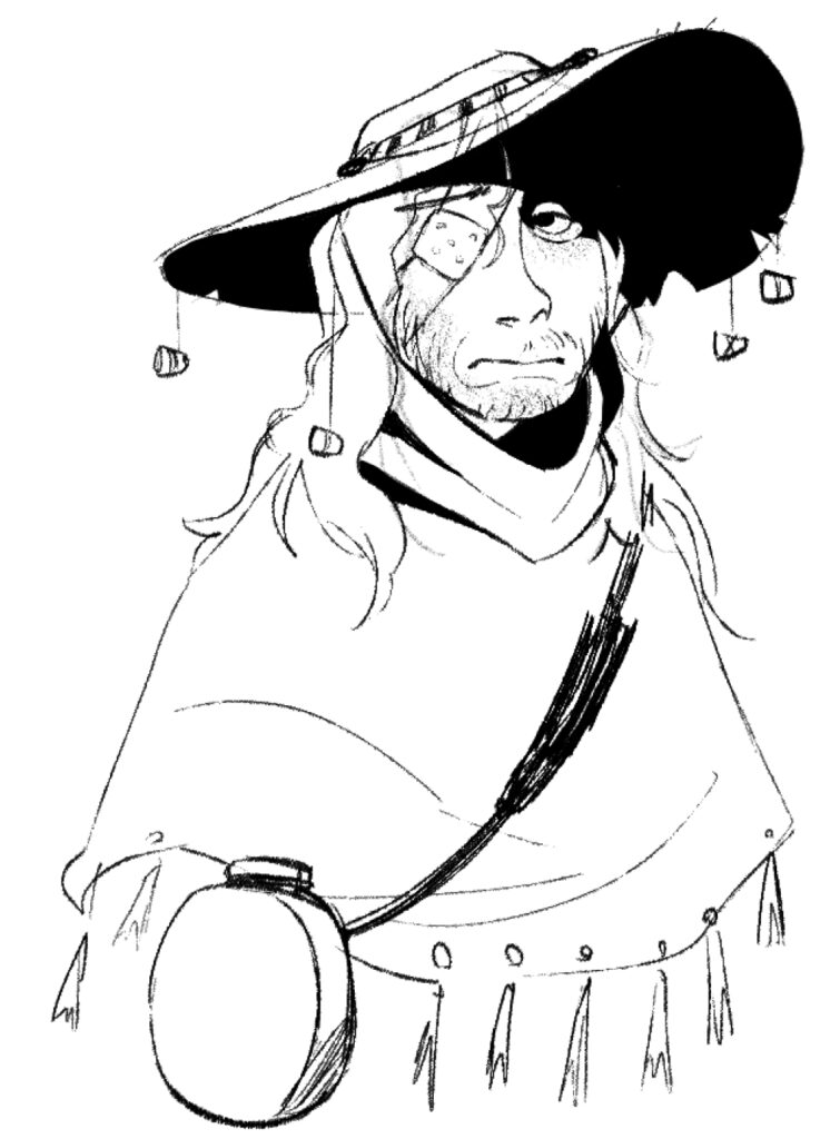
Then, I used this photo I took and used the “extract line drawing” setting, where it makes the white of the image transparent. I then coloured it in, blurring locked layers to create gradients. Here’s a time lapse of the colouring process!
You might notice I also coloured the line work, trying to make it more unified. Now that the base colours were done, I ported it over to Clip Studio Paint, where I added some lighting.
Altogether, this was a very exciting experiment. I think the end result turned out surprisingly nice, and in some ways the pencil texture added lots of charm!
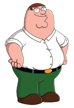
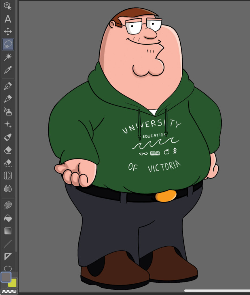
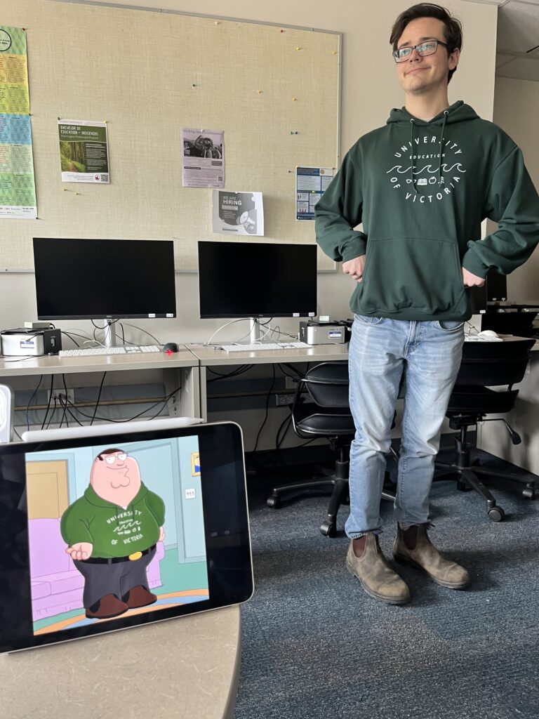
Alright I’m going to be honest this started as a complete joke but I am VERY behind on these inquiry posts so why not! Family Guy art style (and by art style literally just Peter Griffin)
My muse for this drawing was Daniel! He asked for it sooo
I started with this JPEG of Peter Griffin pulled from Google Images. I regretted picking this one quickly as it has actual lighting, as you can see, which is more detailed than the usual Family Guy art style. I’m pretty sure. I’ve never even watched Family Guy I don’t even think I’d like it very much
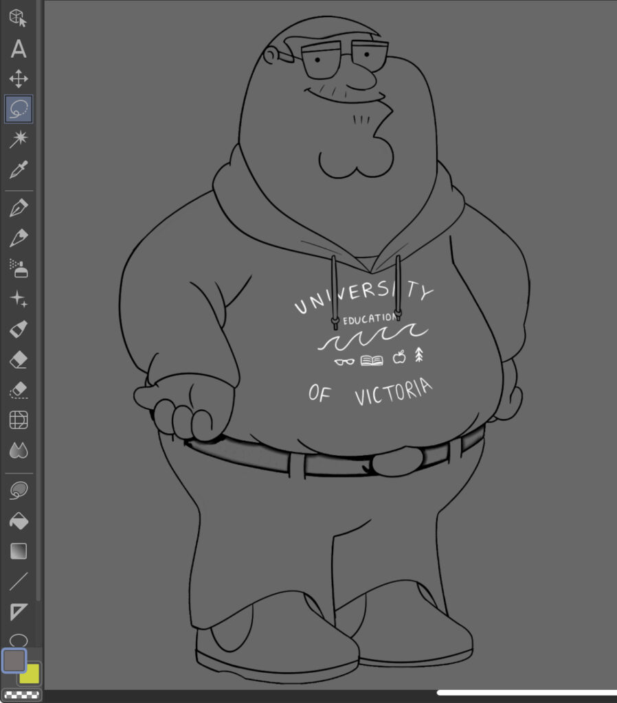
I then extracted the lineart from this using the “extract lineart” effect, and drew my own lineart over top. Some notable changes included a hoodie, different shoes, more square glasses, and a receding hairline since I was a little mean sorry Daniel 😔
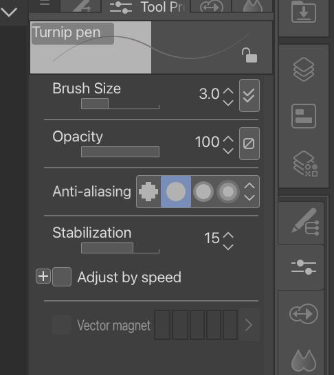
The default brush I normally use already for very well, so I stuck with it. Here’s the configuration!
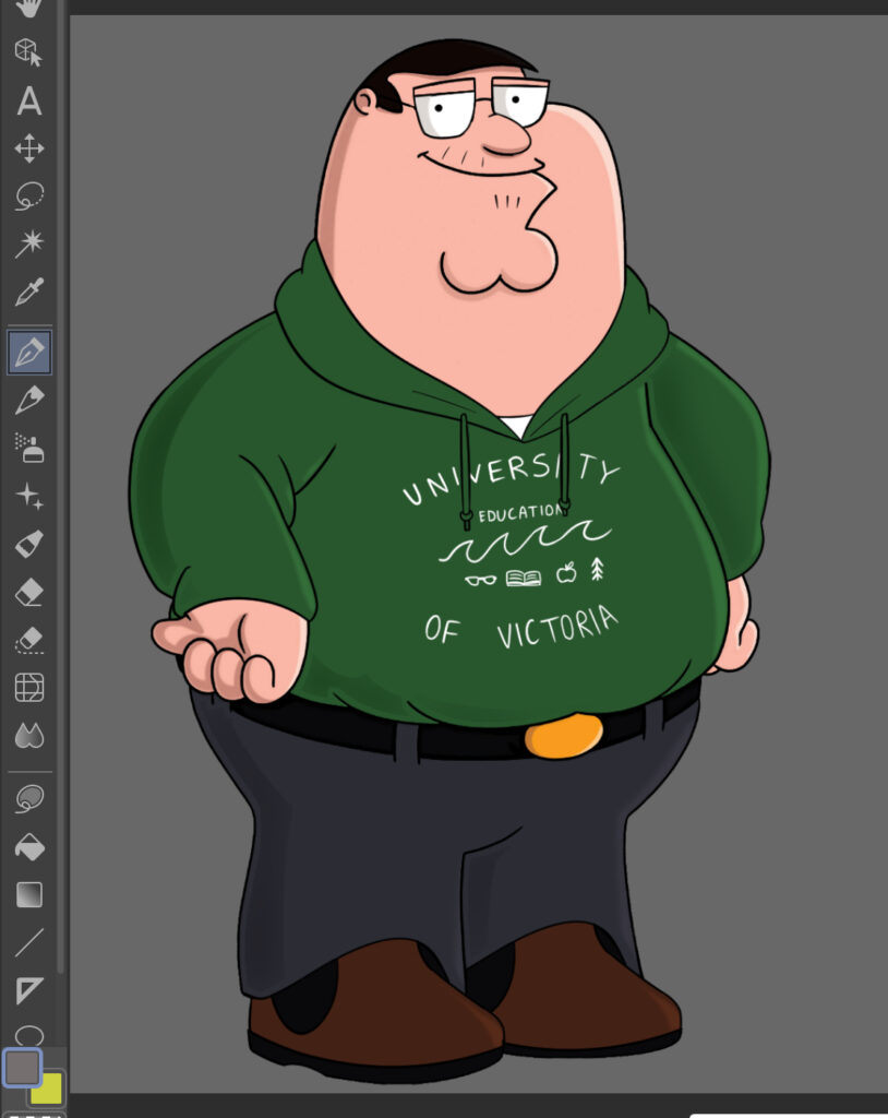
Next, I went in with the flat colours!
Wow. That’s very Daniel!
I then added the lighting to try to match the skin from the Peter Griffin model.
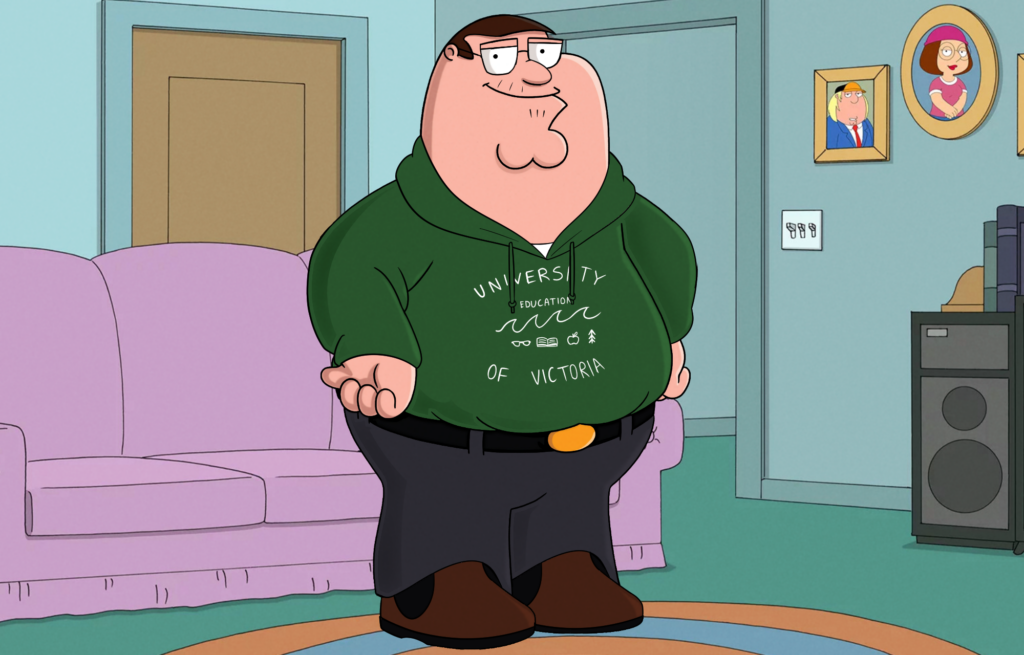
And finally, I added a backdrop from Family Guy and a noise filter to try to make it look more cohesive!
As a fun bonus touch, I cropped the image and ran it through an image de-scaler, to make it look as if it were a screenshot that had been circulating around the internet for a while, slowly losing quality.
Jamie Ramsden, known online under the alias “Jamzdens” has been one of my favourite artists for years, due to her eye-catching bold cartoonist work. Her drawings feature strong shape language, clear and balanced anatomy, and a very tricky blend of wacky cartooning and structured professionalism. I’ve tried drawing in her style in the past, but haven’t quite been able to mimic her understanding of shapes in a 3d space.
all of these examples of Jamie Ramsden’s work have been taken from her portfolio website, which you can view here: https://www.jamieramsden.com/
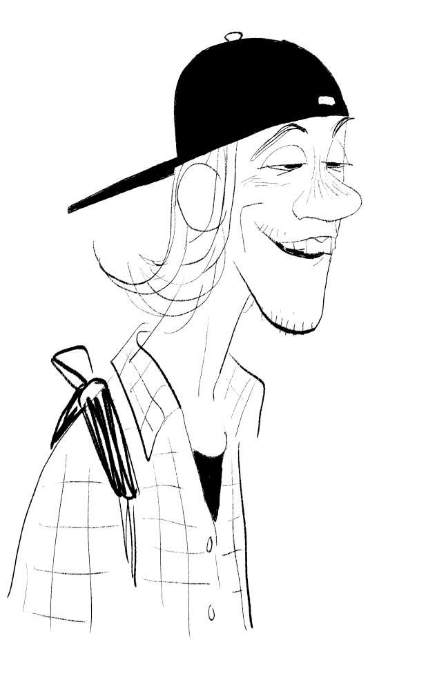
This is the piece I mainly looked to for reference! These figures have a really distinct combination of simple colours and exaggerated shapes paired with defined anatomy. After looking at this and trying to break down the shapes, I gave it my own go!
I started with a rough sketch. I tried emphasizing the shapes in the jacket (squares) and exaggerated the size of the hair.
I then went in with the line art, trying to mimic Jamie’s unique way of drawing fingers. I also forgot to erase a line at the base of the jacket here but I fixed it later!
Here’s the final attempt! Jamie tends to use either warm or cool toned colours, so I tried a more cool wash. Afterwards, I went over with a lasso fill brush to add some solid dark shadows, a trade mark of Jamie’s work. This still doesn’t fully capture the style, but I think it’s at least recognizably similar! I think between this inquiry and the last one, it’s becoming clear to me that many of these artists have very distinct silhouettes and lines of action in their work. I’ll try implementing this going forward!
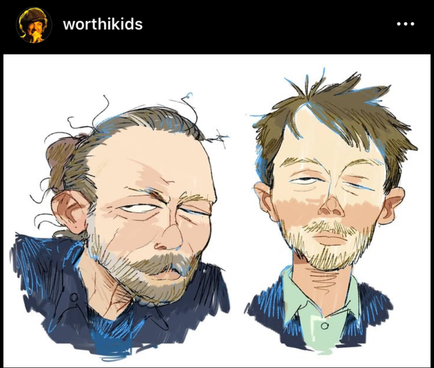
Ian Worthington, known by his online alias “Worthikids,” is widely known for his unique, textured cartoonist art style, as well as his creation of 3d shows in Blender that look 2D, or integrate 2D art on top of 3D models.
As tackling 3D modelling for the first time would be a bit much as a single inquiry entry, I decided to try and emulate some of his 2D drawings and art style. Most of these drawings were taking from his Instagram, which you can find here!
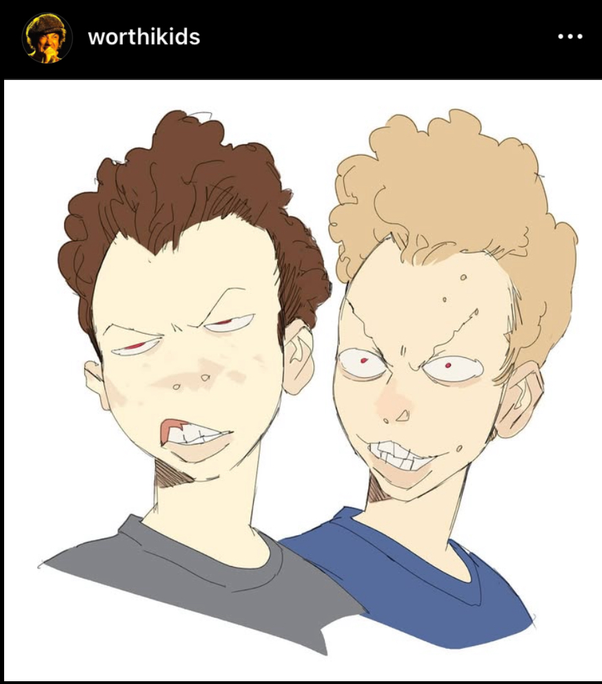
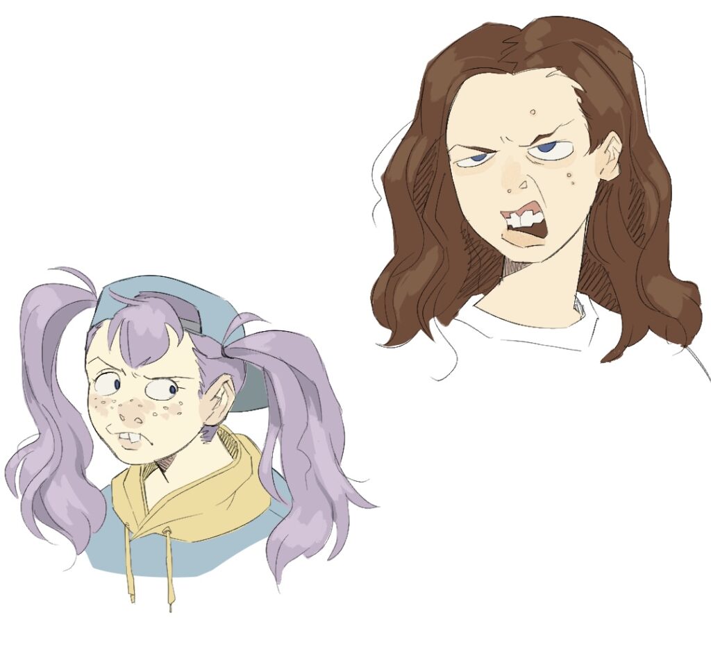
Starting by looking at these busts from Worthikids, I wanted to try to emulate the thin, messy lineart style and patchy skin painting. I find it fascinating how despite using more sketchy lines, Ian’s art remains punchy and easy to read due to the use of bold, simple colouring.
I’m also very drawn to the dramatic lighting in this piece of his. It seems that for the lighting, he uses a more painterly brush on top of solid, un painterly colours. Combining these techniques seen in these pieces, I gave the style my first go!
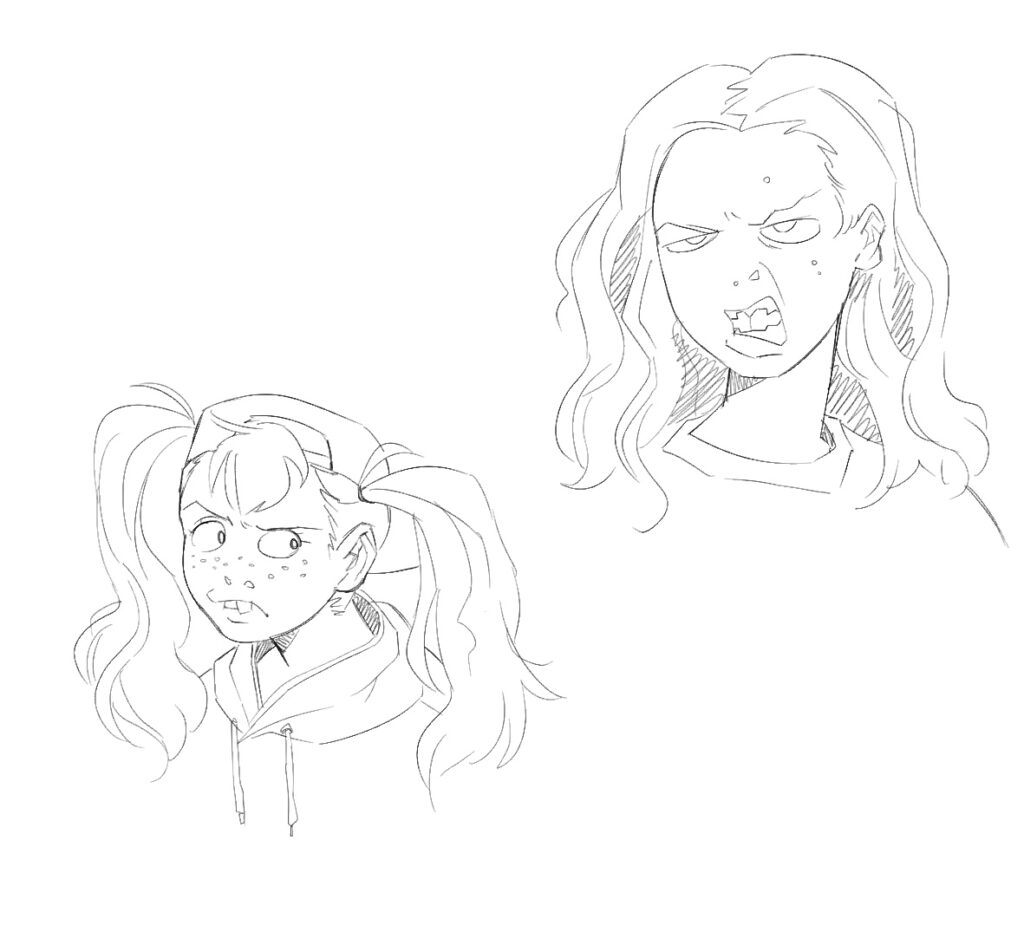
I started with a sketch. I’d noticed that Ian’s art style involved lines that, while confident, often retrace or build line width or contrast through layered lines. This brought me way out of my comfort zone, as I’ve had perfectly neat lineart drilled into me my whole life. I also tried drawing some fun teeth and used the blank “nostrils only” nose style as seen in the first piece referenced.
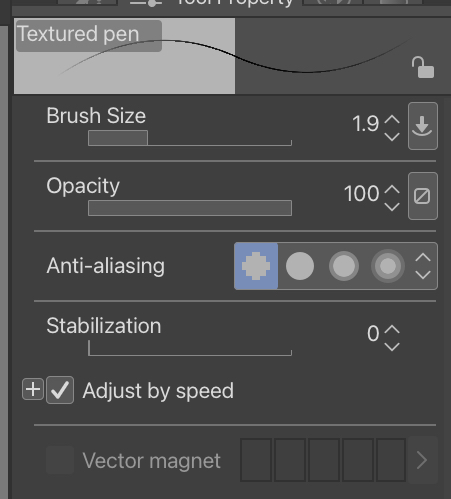
Here’s the brush I used! I turned off stabilization to get a more natural, messy line look. This format was very fun to play with, and I can see myself using this brush in personal work in the future.
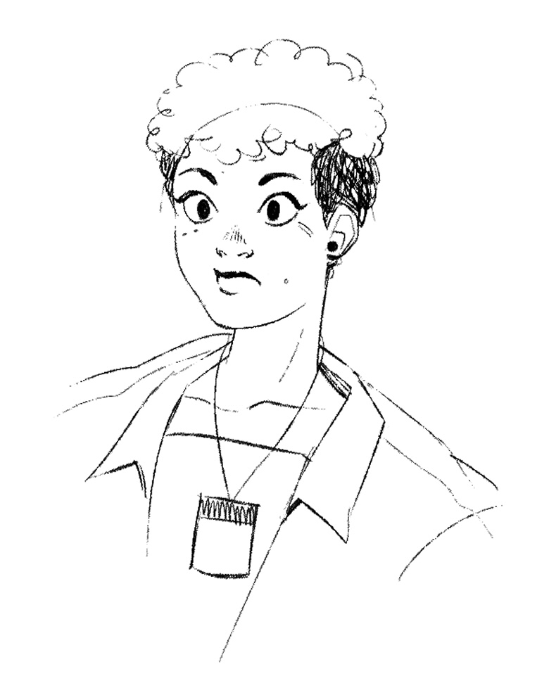
I then filled in the colours, adjusting them to get a more muted, natural look. I used a painterly brush for the highlights and shadows, as well as skin details. These turned out very fun! For the last piece I tried, I referenced these portraits:
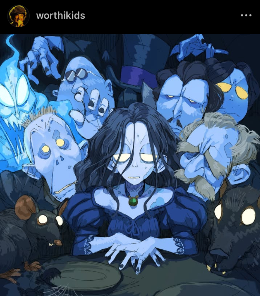
While using the same elements of the previous illustrations, (sketchy line art, painterly details, simple colours) this piece builds upon Ian’s art style as he adds hatching in the hair and clothes, as well as blue splashes in the line art. The base colours themselves also seem to be painted, as we can see the white of the canvas peeking through. I decided to give this style a go!
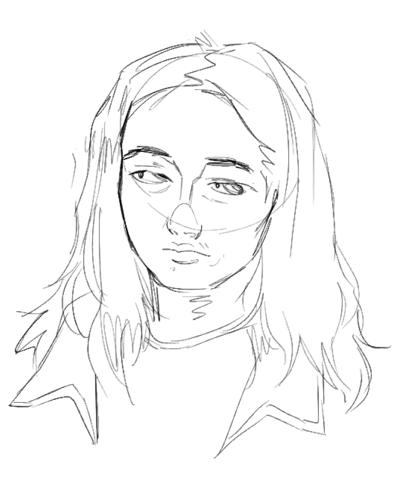
I started with a rough sketch, paying special attention to how Ian draws noses and nose bridges.
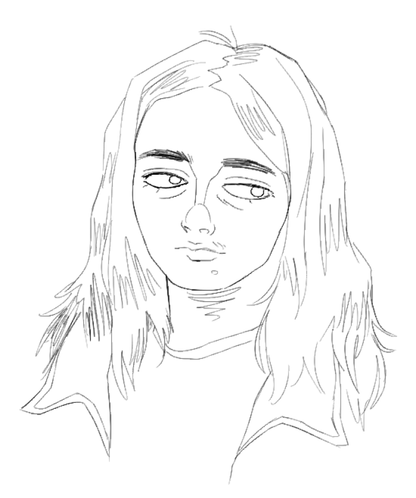
I then went over and drew more detailed line art, without construction lines.
Finally I went in and added colour, as well as hatching in the hair and blue splashes. I probably could’ve added more hatching to the clothing, but I still like the vibe of this finished piece.
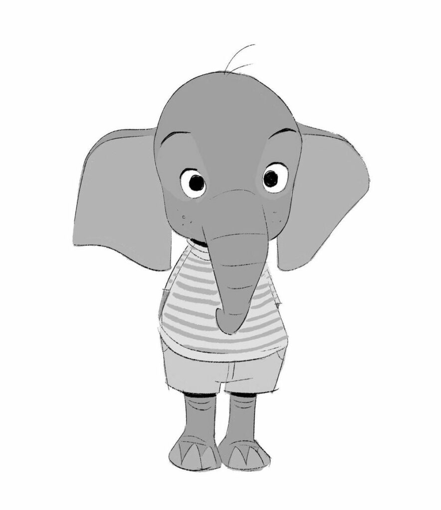
For my free inquiry project I’ll be studying how to draw in the styles of many different artists. For today’s inquiry, I looked at the works of Shiyoon Kim, a famous character designer who has worked on many animated films from Disney, Dreamworks, and Netflix. All the pictures here (unless said to be mine) are from Shiyoon Kim, and you can check out his personal website here:
http://www.shiyoonkim.com
Why Shiyoon?
Shiyoon’s work has always stood out to me for its more loose, speedy style of drawing. As someone who can take days working on a drawing, I really wanted to become comfortable with a more loose style!
Shiyoon also has an incredible sense of scale and proportion, as seen in his work. While I mostly did headshots for this study, I hope to one day also have a great sense of 3d!
Tools I Used:
While Shiyoon Kim has his brushes available to purchase, I am very broke and was able to find a similar brush on the Clip Studio Paint store.
One of the defining features of this style of brush is its varying line width. Shiyoon uses a combination of thick and thin brush strokes in order to add more visual interest, as well as emphasize the separation between something.
In this concept art he did for Big Hero 6, we can see the thin lines used in the hair, where the strokes are part of a single “body,” and thicker lines at the collar and base of chin, where clear separation is important.
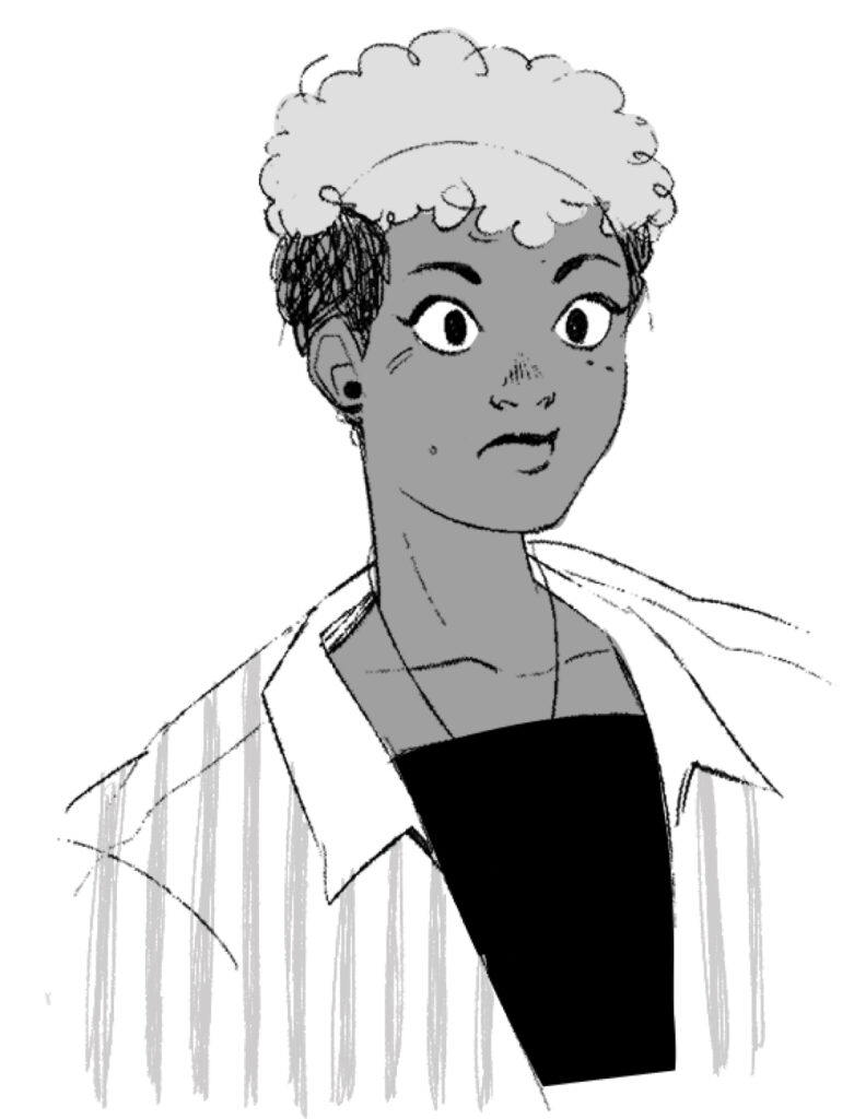
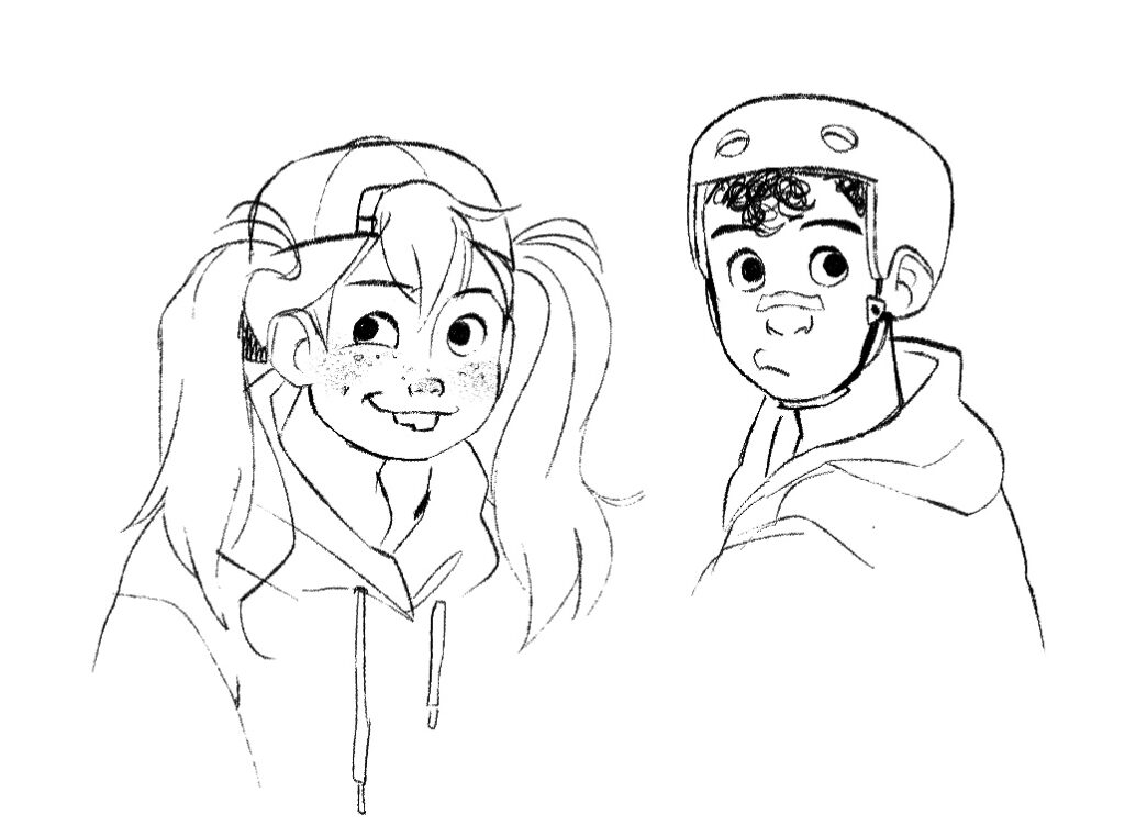
In this concept art done for Raya, we can see Shiyoon use very wispy, scribble lines for hair. Using this example and the above one for reference, I gave it my first go!
This is my first attempt, and while similar enough in vibe still feels a bit stiff around the face. I do think the jacket is closer to the desired looseness though!
I also tried adding some simple greyscale, similar to Shiyoon’s Across the Spiderverse concept art. I like how the vertical stripes came out!
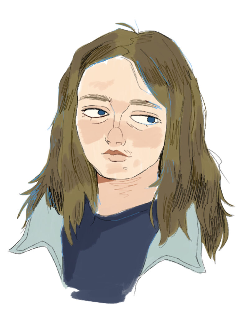
This was my second attempt! I tried adding more texture on the face by using a large pencil brush , and also used that same brush to create a wispy hair look.
this art from Shiyoon has a really cool use of solid black lighting, so I tried adding that to the work above!
awww yeah it’s all coming together 😎😎
Adding the solid shades really makes the piece come together!
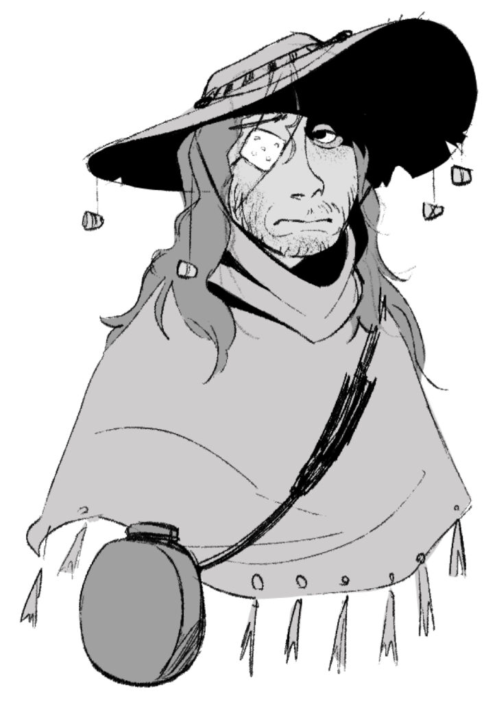
For my final try, I referenced this Shiyoon Kim drawing:
this one, while much neater, still has some of that trademark looseness, as seen with how the lines intercept at the corners. I wanted to try copying how he drew eyes here!
And here’s the final try! This was a super fun style to experiment with, and I feel like I’ve learned a lot. While obviously not 100 percent accurate, I think these pieces look very unique compared to anything I’ve made before!